The Client
Richard Kadrey is the New York Times-bestselling author of more than fifteen novels, including the Sandman Slim supernatural noir series. Sandman Slim was included in Amazon’s 100 Science Fiction & Fantasy Books to Read in a Lifetime. Chad Stahelski of John Wick fame is directing the book as a feature film. Some of Kadrey’s other books include The Grand Dark, Hollywood Dead, The Everything Box, and Butcher Bird. In comics, he’s written for Heavy Metal, Lucifer, and Hellblazer.
The Challenge
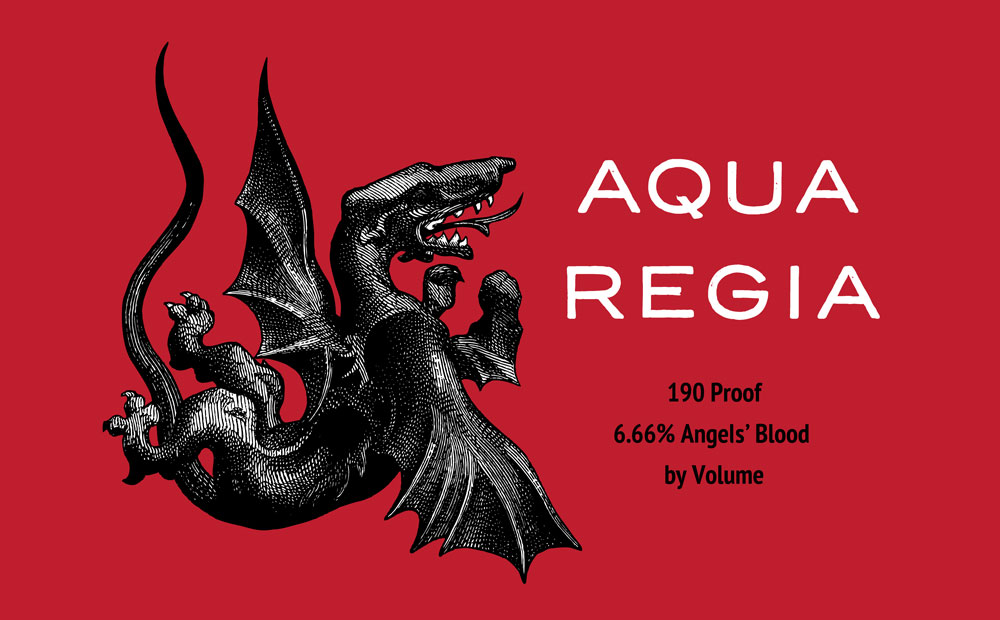
Richard needed a website rebrand to attract a wider audience than the lovers of the niche “dark urban fantasy” for which he’s best known. This followed the release of his book The Grand Dark: “A lush, dark, stand-alone fantasy built off the insurgent tradition of China Mieville and M. John Harrison,” to quote his marketing materials. He also wanted a more robust merchandise page for themed products—I’d previously designed a number of logos for products and businesses appearing in his novels (see “Aqua Regia” final logo and product mockup, below, and alternate versions here).
The Solution
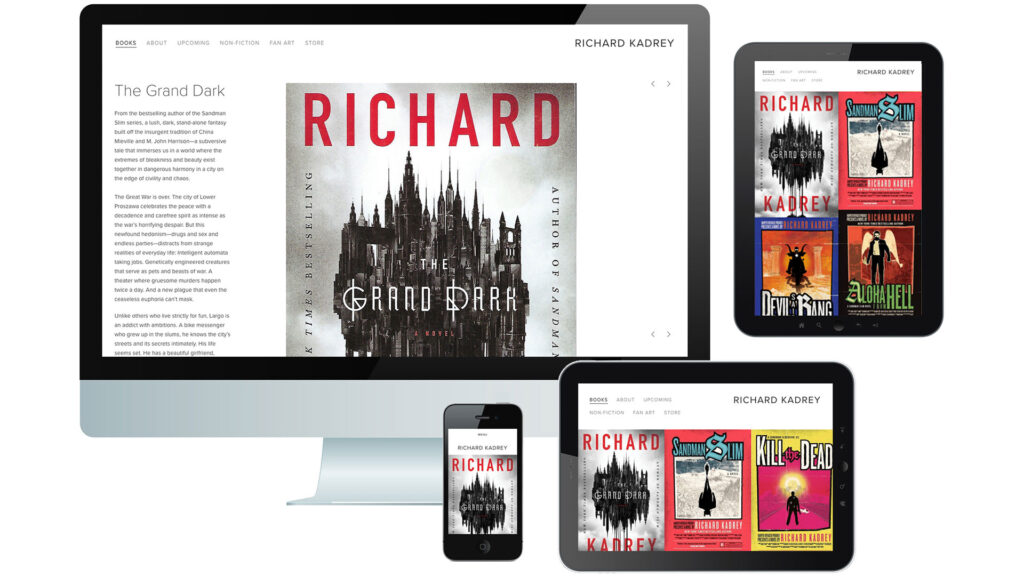
I created a Squarespace website with a contrast of spare, dark gray type surrounded by white space and the vibrant colors of Richard’s book covers. Clicking or tapping on any of the covers on the home page (tablet views, above) would take you to the individual book page (desktop and mobile views, above) with a book summary and buying options.
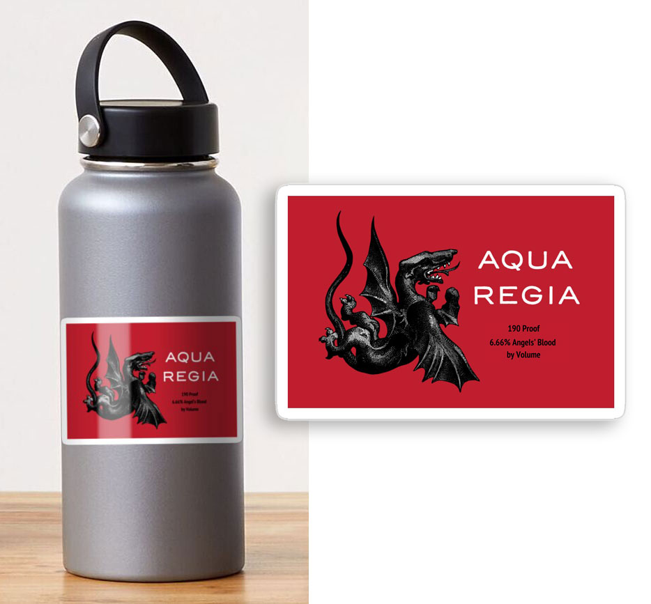
I also included an extensive merchandise page: 15 items each for eight branded product lines. This listing linked to a store I created on the Redbubble print-on-demand website (see product mockup below).
The Impact
Incorporating expansive elements to attract a new audience, the website redesign achieved a 26% increase in online engagement that, in only four months, contributed to an 80% increase in merchandise revenue.
Additional branding
I designed a number of logos for products and businesses appearing in Richard’s novels. “Aqua Regia” is the name of an extremely potent tipple drunk by “Hellions”—Hell’s denizens—and a few hardy mortals, including James Stark, Sandman Slim himself. The libation is 190 proof—95% ethanol—and contains 6.66% Angels’ blood. From copy I wrote on the website:
“What’s that you say? The numbers don’t add up? That’s Hellion math. Stick these labels to your favorite containers to instantly transform the contents into Hell’s beverage of choice. Mugs perform the same magical change, and t-shirts proclaim your love.”
I used a black and white engraving of St. George’s dragon—reenvisioned as a demonic Hellion—on a blood-red ground, with large white type for “Aqua Regia” and smaller black type for the taglines (see product mockup).
Redbubble mockup of an Aqua Regia sticker on a water bottle.


