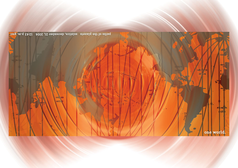
I originally created this printed card in a palette of red and oranges, for some unknown reason.
It was a hopeful holiday greeting to remind the recipients that we are all connected. The artwork has many layers in Photoshop: the paths of the planets on the solstice, the shapes of the continents, and overlapping whorls of color. The card was cropped in to the hard edge and shipped flat. When you bent the card around on itself, following an included diagram, the continents lined up to make One World.
Note: I used the Mercator projection for the map but wish I’d used the Gall-Peters projection (third image). In the Gall-Peters version, the equator is in the center of the image instead of below it, resulting in a more accurate relative proportions of land masses, even though the land mass sizes are distorted as one moves further away from the equator.
The featured image, in blue tones, is a reworking several years later which I didn’t send out. I liked the cool color palette better; it felt more peaceful than the frenetic warm color palette of the original. The image also shows the card bent around to meet itself.
If I were going to redo it yet again I’d change the parts of the world that were in daylight at the hour of the solstice to a light or yellow color. Maybe I will.
