THIS IS NOT A TIME TO BE DISMAYED.
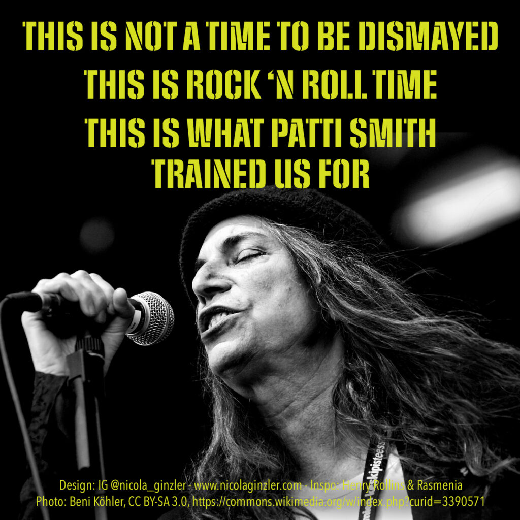
Patti Smith (https://en.wikipedia.org/wiki/Patti_Smith) is an American singer, songwriter, poet, painter, author and photographer who’s still rocking at 77 years old. She’s been fighting for the right side of history longer than most of us have been alive. Please share this (with credits)! COMMIT to doing political work to organize and fight! COMBAT the forces that […]
Phone Font Friday: A Glowing Font Created by Waving an iPhone in the Dark

From wired.com: Next >> View all
Forgotten Font Friday
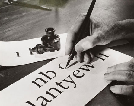
A lovely type-related article from Atlas Obscura, chroniclers of the strange and wonderful. The Lost Typefaces of W.A. Dwiggins The pioneering designer created dozens of fonts, only a few of which are still around today. By CARA GIAIMO for Atlas Obscura
Fonting While Female Font Friday
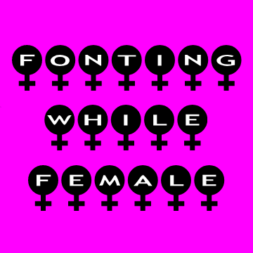
Golly gosh, folks, this Sunday, March 8 is International Women’s Day! Isn’t it neat that they let us ladies have a whole day to ourselves? And a whole month to ourselves too? One out of twelve is just nifty! In any case, I thought I’d celebrate the day’s novel status with some typography for this, […]
Fourth-Dimension Font Friday
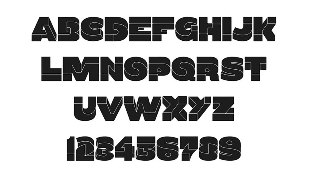
This font will make your brain hurt Oxymora is a typeface that evokes the twisting, non-Euclidian geometry of MC Escher’s artwork By Carl Franzen (Birgit Palma/Cargo Collective/Inspiration Hut) Impossible, twisting geometric artwork abounds across the internet (see The Verge‘s logo for one prominent example). So it seems high time that someone made a similarly reality-defying font. […]
Found Font Friday 2

Not to be confused with my post Found Font Friday 1, the tale of a bitter turn-of-the-20th-century rivalry which led to economically valuable—and artistically priceless—metal type being flung into London’s River Thames, to be recovered only after a lapse of a hundred years. This post deals with matters cheerier, cheekier, and altogether less grim. From […]
Forensics Fonts Friday

Forensics professionals pay a great deal of attention about what fonts to use in courtroom exhibits concerning or reproducing digital evidence. To quote a paper by Fred Cohen & Associates of the California Sciences Institute [abstract below] “fonts for forensics are less about the beauty of the presentation and more about the tradeoff between readability […]
Fake Font Friday 3

Today we salute fonts that fake text itself. Microdot replaces every character with the placeholder rectangle from regular fonts, and Blokk replaces characters with horizontal lines. Type in either font gives the effect of a block of copy (or headline) without distracting the viewer with content. Both are great for making wireframes or mockups. Not […]
Famous Font Friday

Ever wondered what all the world’s most famous companies’ fonts are? Yes? Congratulations! You are a type nerd who will probably enjoy this fascinating info! No? Give it a look anyway, you might get hooked on letterforms in spite of yourself. Famous Logo Fonts A look at most popular fonts used in the logos of […]
Food Font Friday 3

Fontmeme.com provides font sources and information for typography in many fields, from airlines (see my post, Flight Font Friday) to movies to sports. See also my previous posts Food Font Friday 1: a typographic map of American foods, and Food Font Friday 2: Typografische Schokolade (Typographic Chocolate). Food and Drinks Fonts Page 1 / Page […]
Phony Font Friday

Part three of five articles concerned with spotting fake Louis Vuitton merchandise. This cool font-related piece is about the font and spacing of the characters in the signature heat-stamped label. Mostly the signals of an authentic label are subtleties of spacing, alignment, and character shape. Font geeks, pull up a chair! Spotting Fake Louis Vuitton […]
Fake Font Friday 2

From Christian Naths at GitHub: More fun dummy text to download and use! Not to be confused with my posts Fake Font Friday 1, Fake Font Friday 3 and Fake Font Friday 4. Redacted: A Font for Web and Desktop Redacted Regular
Fabric Font Friday

I saw this framed fabric at Britex Fabrics in San Francisco. Britex is an amazing emporium of all things fabric, from single buttons to $200-a-yard sequinned loveliness. Yes, I know, I should get a bunch of the font fabric and upholster my house in it!
Flesh-Free Font Friday

Skeletons! A classic Halloween visual. Here’s a skeleton font from a new-to-me source: home machine embroidery. How the embroidery works: you install software from a website or disk and it tells your home embroidery machine—your enhanced sewing machine or dedicated device—how to make the letterforms or designs. This alphabet was developed by trishsthreads.com and is […]
Flesh Font Friday (NSFW)

From designboom: a series of ethereal photographs by greek artist anastasia mastrakouli utilizes the nude human form to highlight the dialectical relationship between anatomy and visual art. each image is the product of an experimental performance, rendered as a composition of a silhouette and surface while conforming to the shape of the english alphabet. cut […]
‘F is for The Flash’ Font Friday

Alphabet created by Simon Koay, from SimonKoay.com: Superbet ‘Superbet’ is a typographic exploration of alphabet design by reimagining each letter of the alphabet as everyone’s favourite superheroes and supervillains. Each letter has been created with inspiration from characters who share that same initial in their name.These would be great for kids, or as CNet put it, “perfect for any bedroom wall or […]
Fake Font Friday 1

Just a quick visual so you know why their handwriting looks like that: Not to be confused with my posts Fake Font 2, Fake Font 3 or Fake Font 4. Link to larger size. Created by Orion Champadiyil (web, Twitter).
Fleuron Font Friday

A fleuron, or flower, is a decorative typographic character. The category of fleuron includes some characters that are not floral in design. Also known as a printer’s flower or floret. Flowers are in a category of characters known as ornaments or type ornaments. Scroll down or jump to here for a short essay on fleurons. […]
Fenotype Foundry Font Friday

Fenotype Font Company is the type foundry of Finland-based type designer Emil Bertell. Bertell started Fenotype in 2012 and has designed hundreds of typefaces since then. You can see all his fonts at http://www.fenotype.com/font/fontpage.htm and download the free ones there. Below is a short article from MyFonts, where Bertell’s commercial typefaces are available. His typefaces there are […]
Forgotten Font Friday

A lovely type-related article from Atlas Obscura, chroniclers of the strange and wonderful. The Lost Typefaces of W.A. Dwiggins The pioneering designer created dozens of fonts, only a few of which are still around today. By CARA GIAIMO for Atlas Obscura
‘Forgetting the Point of a Website’ Font Friday

An excellent rant from a developer who’s sick of designers using “cool” but unreadable web fonts. Written in 2012, so many advances have been made since then towards getting cool type to be readable (e.g. Google Fonts), but the point stands. Web font rant, forgetting the point of a website This is just a rant […]
Multinational Typeface, Letters Based on National Flags

From ad agency GSK Unit @Grey Singapore. Much has been written and said about the needs of our global economy. In fact: heated debates have and are still taking place about the dichotomy of global vs. local. Here’s our take on it all: when you set up a new hub to work with the rest […]
‘Comic Papyrus’: A Typeface Combo of the Two Loathed Fonts Papyrus and Comic Sans

By Justin Page from Laughing Squid. Papyrus and Comic Sans are two widely available typefaces that are often said to be overused and criticized by graphic designers. Artist Rob Barth of the Barth and Co design firm took it into his own hands earlier this year to create a typeface combo, appropriately titled “Comic Papyrus,” […]
Fuller Folies Font Friday

The Folies Bergère is a cabaret music hall, located in Paris, France. Established in 1869, the house was at the height of its fame and popularity from the 1890s’ Belle Époque through the 1920s’ Années folles. (See my post about the Folies facade here.) Loie (Loïe) Fuller was an American modern dancer and choreographer who […]
Foreign Font Friday 1

These foreign-look fonts explore the different shapes and rhythms of non-roman type, in a roman font. All are available here.
Fruitcake Font Friday

Oxfam 2011 Holiday Campaign by Jessica Hische For the 2011 holiday season, Oxfam International enlisted the beautiful lettering and illustration work of Jessica Hische. Besides all of the excellent typography and witty messaging, these ads encourage donations for a wonderful cause. Oxfam consists of multiple international groups that partner and campaign for resolving poverty and […]
Flip-Free Font Friday

Christian Boer designs typeface for readers with dyslexia “When they’re reading, people with dyslexia often unconsciously switch, rotate and mirror letters in their minds,” said Boer, who is dyslexic himself. This “anti-flip” typeface is designed to reduce that possibility. Istanbul Design Biennial 2014: a typeface created specifically for dyslexic people by Dutch designer Christian Boer […]
Fantastic Four Font Friday

From fontmeme.com: “Fantastic Four font” here refers to the font used in the poster title of Fantastic Four, which is an American superhero film based on the Marvel Comics of the same name. The film was directed by Tim Story and released in 2005. The font used in the title for the theatrical release poster […]
Fungus Font Friday

Great shimeji mushrooms font from handmadefont: Mystical mushrooms create interesting letter figures, bringing an original atmosphere to an illustration. Super food can create super designs, give it a chance. Mushroom font is made of high-resolution photos and contains letters, symbols and numbers. Every letter has a transparent background ready for placement in your design. Mushrooms […]
Found Font Friday 1

Printing blocks for a typeface called Doves Type have been discovered in the River Thames, London. By Rachael Steven from CreativeReview. Not to be confused with my blog post Found Font Friday 2. Image taken by Sam Armstrong, courtesy of The Sunday Times. Scroll to the bottom to see a short video by the BBC […]
Filament Font Friday

Tesla Font, a Free Font “The inspiration for this typeface was found in the circuitry of lightbulb filament and wiring intricately crossing paths.” DOWNLOAD TESLA ALTERNATE HERE
Follicle Font Friday

Kind of disgusting, but cool. An Eccentric, Wacky Typeface Created With Hair By Loke Shi Ying from DesignTaxi Amsterdam-based designer Monique Goossens has recently created a fun and wacky typeface out of human hair. This interesting typeface is constructed out of strands of hair gathered together. Each clump of hair is shaped to form a […]
Font Film Font Friday

See also Film Fonts Friday 1; Film Font Friday, Wes Anderson Edition; (Bond) Film Font Friday; and (Oscar) Film Font Friday An homage to Times New Roman, a typeface designed for The [London] Times in 1931 and used everywhere since. From the Unquiet Film Series. https://www.dandad.org/awards/professional/2015/branded-film-content-entertainment/24476/the-times-unquiet-film-series-times-new-roman/
Feuilles Font Friday

Oratorical Type, An Alphabet Made out of Carved Books From Laughing Squid by EDW Lynch
Fish Food Font Friday

Dion Star’s Marine Debris Typeface is made from sea debris that has washed up on the shore in England. One day while walking along the beach in England, Dion Star stumbled across a little green clothespin. Being a graphic designer, Star immediate realized that this pin was more than just a bit of litter that […]
“Hanging by a serif” by John D. Berry

A big shoutout to my friend John D. Berry, whose book Hanging by a serif has just been released. Click on the pages for a closer look. Hanging by a serif A few words about designing with words Text & design by John D. Berry A small book of epigrams, insights on the […]
Fearsome Font Friday

In celebration of the SyFy network’s world-class, glorious horror movie “Sharknado” (see my previous post, ‘”Sharknado” saves the Summer!’), today we have three fearsome fonts guaranteed to strike terror into the hearts of all who behold them.
Extreme Typographic Nerdery, Part 1: Making Sense of Type Classification

By Joseph Alessio from SmashingMagazine.com: In my previous article on Smashing Magazine (“Understanding the Difference Between Typography and Lettering”), I wrote about how understanding type terminology can help us better appreciate the arts of typography and lettering. This article again deals with terminology, probably more specifically than most designers are used to, and the title […]