Found Font Friday – original

With regard to the surreptitious disposal and triumphant recovery of the Doves Type from London’s Thames River (from an article in typespec magazine): The Doves Type® revival . Not to be confused with my post Font Friday 2, about fonts created from lettering and signs found in the great outdoors. Raised from the dead: The Doves Type […]
Forgotten Font Friday
A lovely type-related article from Atlas Obscura, chroniclers of the strange and wonderful. The Lost Typefaces of W.A. Dwiggins The pioneering designer created dozens of fonts, only a few of which are still around today. By CARA GIAIMO for Atlas Obscura
Free Tree Font Friday

From Atlas Obscura. Read the Tree Leaves, With an Artist’s Invented Tree Font The plants are speaking. Time to read what they have to say. The phrase “about trees,” shown in the font Trees
Kintsugi: The Art of Broken Pieces

by Christopher Jobson from colossal.com Wikipedia Kintsugi (or kintsukuroi) is a Japanese method for repairing broken ceramics with a special lacquer mixed with gold, silver, or platinum. The philosophy behind the technique is to recognize the history of the object and to visibly incorporate the repair into the new piece instead of disguising it. The […]
(Batman) Forever Font Friday

From 3D print vendor JB Cookie Cutters, cookie cutters in the shapes of the “Batman Forever” font! Really! You can use these with cookie dough, with fondant to decorate the cake of a lucky child (or adult), or with any rolled material. The “Q” is backwards, but nobody’s perfect.
Japanese Artist Creates Fun Miniature Dioramas Every Day For 5 Years

From boredpanda.com Since 2011, Tatsuya Tanaka has been creating creative and playful miniature dioramas. Not only has he not shown any sign of stopping since we last wrote about him, but he seems to be getting better and better Tanaka has been collecting the creative images into an everyday calendar that you can follow on Facebook or […]
Film Font Friday, Wes Anderson Edition

See also Film Fonts Friday 1; (Bond) Film Fonts Friday; Font Film Font Friday; and (Oscar) Film Font Friday. Sara Enríquez from Madrid, Spain created these whimsical typographic illustrations as an homage to film director Wes Anderson. See if you can figure out which film each letter goes with, then scroll down to check your […]
Funny Font Friday 1

Here are five movies (of many) from fontmeme.com to make you giggle, laugh, or perhaps snort. See also my post Funny Font Friday 2, a silly alphabet book ca. 1850. Parks and Recreation Font Parks and Recreation is an American television sitcom starring Amy Poehler as Leslie Knope, a perky, mid-level bureaucrat in the parks […]
Fantasy Font Friday

Escape to a world that never was in these movies and TV shows. A better world? A worse one? You decide. Via fontmeme.com. Here are six but there are many more. Spirited Away Font Spirited Away is a 2001 Japanese animated fantasy film written and directed by Hayao Miyazaki and produced by Studio Ghibli. The […]
Family Font Friday

Fun fonts from family films! Via fontmeme.com. Here are five titles but there are many more. Marley & Me Font Marley & Me font here refers to the font used in the poster of Marley & Me, which is a 2008 American comedy drama movie about the adorable but naughty and neurotic dog, Marley, from […]
Fightin’ Font Friday 2

Action fonts! Movie posters with all the fightin’ fonts you need, from fontmeme.com. Here are five but there are many more. See also my post Fightin’ Font Friday 1, a typeface for model combat aircraft. Spectre (Film) Font Spectre is the twenty-fourth James Bond film produced by Eon Productions. It was directed by Sam Mendes […]
Far, Far Away Font Friday

From Yves Peters at fontshop.com on December 14, 2015 (revised December 20, 2015): An exhaustive article on the various versions of the fonts for the “iconic opening [text] crawl” and posters for each Star Wars movie! To say a whole lot of people are getting a whole lot of excited about Star Wars: The Force […]
Le Choléra: Le Petit Journal, December 1, 1912

One hundred and three years ago today, Le Petit Journal, a French newspaper, featured an illustration of cholera, which was decimating the troops of World War I: Death cuts through the marching men with a scythe. Notably, the men wear the red fez, identifying them as Tirailleurs Sénégalais. (Tirailleur translates variously as “skirmisher,” “rifleman,” or […]
92-Year-Old Grandmother Creates Amazingly Complex Temari Balls

By Noel Kat from mymodernmet: These stunning embroidered balls called “temari” were made by the prodigiously nimble fingers of a 92-year-old grandmother in Japan. Although she only learned this elaborate skill in her sixties, she has since created nearly 500 unique designs that have been photographed by her granddaughter NanaAkua. Impressive does not even begin […]
‘Forgetting the Point of a Website’ Font Friday

An excellent rant from a developer who’s sick of designers using “cool” but unreadable web fonts. Written in 2012, so many advances have been made since then towards getting cool type to be readable (e.g. Google Fonts), but the point stands. Web font rant, forgetting the point of a website This is just a rant […]
Monaco’s Pantone Cafe is a Beautiful Place to Eat

From mentalfloss: Image credit: Pantone Cafe Pantone—the corporation behind the popular color-matching system developed by Lawrence Herbert in 1963—now has a cafe that blends pastries with their trademark aesthetic. Arguably one of the most photogenic cafes in the world, the restaurant invites customers to “taste the colors.” It’s hard not to feel like you’re eating […]
A Selfie on the Edge of Space

By Glen Tickle from Laughing Squid: A recent episode of the series Seeker Stories explains how photographer Christopher Michel was able to take a selfie at the age of space. While on assignment, Michel was given the opportunity to fly in a Lockheed U-2 spy plane that provided him some impressive views of the Earth.
Multinational Typeface, Letters Based on National Flags

From ad agency GSK Unit @Grey Singapore. Much has been written and said about the needs of our global economy. In fact: heated debates have and are still taking place about the dichotomy of global vs. local. Here’s our take on it all: when you set up a new hub to work with the rest […]
‘Comic Papyrus’: A Typeface Combo of the Two Loathed Fonts Papyrus and Comic Sans

By Justin Page from Laughing Squid. Papyrus and Comic Sans are two widely available typefaces that are often said to be overused and criticized by graphic designers. Artist Rob Barth of the Barth and Co design firm took it into his own hands earlier this year to create a typeface combo, appropriately titled “Comic Papyrus,” […]
Four or Five Fonts Friday

Combining fonts is an art rather than a science, but there are basics that will help you make decisions. Typography.com has some ideas. (Not to be confused with my blog post Font-Pairs Font Friday, which suggests five websites for AI-generated two-font pairings.) Four Techniques for Combining Fonts Building a palette is an intuitive process, and […]
Folies Facade Font Friday

The Folies Bergère is a cabaret music hall, located in Paris, France. Established in 1869, the house was at the height of its fame and popularity from the 1890s through the 1920s. The building was updated in the 1920s with a strong Art Deco font and sculptural inset. The type on top of the building […]
Fuller Folies Font Friday

The Folies Bergère is a cabaret music hall, located in Paris, France. Established in 1869, the house was at the height of its fame and popularity from the 1890s’ Belle Époque through the 1920s’ Années folles. (See my post about the Folies facade here.) Loie (Loïe) Fuller was an American modern dancer and choreographer who […]
Fingers, Facial Hair, and Phalluses Font Friday

Art History Masterpieces Transformed Into Surreal Typefaces By Alison Nastasi from Flavorwire Typography and art nerds, this one’s for you. Israeli designer Oded Ezer (who we first spotted on Co.Design) enjoys playing with type to create unusual fonts — and he’s designed some humorous typefaces inspired by the annals of art history. Vermeer’s Girl with a Pearl Earring, […]
Foreign Font Friday 1

These foreign-look fonts explore the different shapes and rhythms of non-roman type, in a roman font. All are available here.
Fruitcake Font Friday

Oxfam 2011 Holiday Campaign by Jessica Hische For the 2011 holiday season, Oxfam International enlisted the beautiful lettering and illustration work of Jessica Hische. Besides all of the excellent typography and witty messaging, these ads encourage donations for a wonderful cause. Oxfam consists of multiple international groups that partner and campaign for resolving poverty and […]
Flip-Free Font Friday

Christian Boer designs typeface for readers with dyslexia “When they’re reading, people with dyslexia often unconsciously switch, rotate and mirror letters in their minds,” said Boer, who is dyslexic himself. This “anti-flip” typeface is designed to reduce that possibility. Istanbul Design Biennial 2014: a typeface created specifically for dyslexic people by Dutch designer Christian Boer […]
Fantastic Four Font Friday

From fontmeme.com: “Fantastic Four font” here refers to the font used in the poster title of Fantastic Four, which is an American superhero film based on the Marvel Comics of the same name. The film was directed by Tim Story and released in 2005. The font used in the title for the theatrical release poster […]
Fungus Font Friday

Great shimeji mushrooms font from handmadefont: Mystical mushrooms create interesting letter figures, bringing an original atmosphere to an illustration. Super food can create super designs, give it a chance. Mushroom font is made of high-resolution photos and contains letters, symbols and numbers. Every letter has a transparent background ready for placement in your design. Mushrooms […]
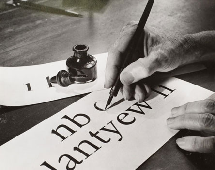
Found Font Friday 1
Printing blocks for a typeface called Doves Type have been discovered in the River Thames, London. By Rachael Steven from CreativeReview. Not to be confused with my blog post Found Font Friday 2. Image taken by Sam Armstrong, courtesy of The Sunday Times. Scroll to the bottom to see a short video by the BBC […]
#Ferguson Font Friday

Use any goddamn font you like to help out: Michael Brown Memorial Fund Feed the Students of Ferguson Fund. Ferguson schools have been closed since Monday, and many students depend on school meals. Donations go directly to the St. Louis Area Food Bank. For information about volunteering, go here. Attend (or organize) a nonviolent demonstration […]
Filament Font Friday

Tesla Font, a Free Font “The inspiration for this typeface was found in the circuitry of lightbulb filament and wiring intricately crossing paths.” DOWNLOAD TESLA ALTERNATE HERE
Follicle Font Friday

Kind of disgusting, but cool. An Eccentric, Wacky Typeface Created With Hair By Loke Shi Ying from DesignTaxi Amsterdam-based designer Monique Goossens has recently created a fun and wacky typeface out of human hair. This interesting typeface is constructed out of strands of hair gathered together. Each clump of hair is shaped to form a […]
Font Film Font Friday

See also Film Fonts Friday 1; Film Font Friday, Wes Anderson Edition; (Bond) Film Font Friday; and (Oscar) Film Font Friday An homage to Times New Roman, a typeface designed for The [London] Times in 1931 and used everywhere since. From the Unquiet Film Series. https://www.dandad.org/awards/professional/2015/branded-film-content-entertainment/24476/the-times-unquiet-film-series-times-new-roman/
Feuilles Font Friday

Oratorical Type, An Alphabet Made out of Carved Books From Laughing Squid by EDW Lynch
Flying Font Friday 1

Also see my post Flying Font Friday 2, about typeforms found in butterfly wings. Why the Same Three Typefaces Are Used In Almost Every Airport From Gizmodo by Alissa Walker Wayfinding signage is an invisible network draped upon our public places. And that network has to work especially hard in airports when we’re lost, hungry, […]
Fish Food Font Friday

Dion Star’s Marine Debris Typeface is made from sea debris that has washed up on the shore in England. One day while walking along the beach in England, Dion Star stumbled across a little green clothespin. Being a graphic designer, Star immediate realized that this pin was more than just a bit of litter that […]
How to shelter from fallout after a nuclear attack on your city

From io9.com: Terrorists have detonated a low-yield nuclear warhead in your city. How long should you hide, and where, to avoid the worst effects of radioactive fallout? We talked to Lawrence Livermore National Laboratory atmospheric scientist Michael Dillon to find out. Yesterday Dillon published a paper on this topic in the Proceedings of the Royal […]
Letter written by ten-year-old Hellen Keller

By Susan Martin, Collection Services, from the Massachusetts Historical Society: Those of us who process manuscript collections are always stumbling on interesting and unexpected finds. I was recently working with the MHS’s George E. Ellis papers to improve the arrangement and description of the collection, and one letter immediately caught my eye. It was written […]
High-Res Scan of Poe’s “Raven,” Illustrated by Doré

By Cory Doctorow at BoingBoing.com: The Library of Congress’s website hosts a high-resolution scan of a rare edition of Edgar Allan Poe’s “The Raven” illustrated by Gustave Doré. The title-page is at page 11, the list of illustrations is on page 14. The illustrations are amazing, like no other illustrated Poe I’ve seen. I’ve collected my […]
Mayonnaise Hatred: A Brief History of Mayo and Disgust

By David Merritt Johns from Slate.com: Near where I work there is a deli with a basket on the counter piled high with mayonnaise packets. They’re complimentary: If you buy a sandwich, you can take as many as you want. I know that decent folks nab just one or two, but I have a hard […]
Federal Font Friday

By Tom Vanderbilt from a February 2004 article on Slate.com: Courier, Dispatched: How the Federal Government—more specifically, U.S. State Department—put the kibosh on the typewriter font. In late January [2004], an announcement from the U.S. State Department generated certain chatter along the generally indiscernible diplomatic-typographic axis. This was the news that as of February 1, […]
The Roaring ‘Twenties: an interactive exploration of the historical soundscape of New York City

An interactive website by historian Emily Thompson exploring the aural atmosphere of New York City in the 1920s. [See also my post “Peddlers, jackhammers, whistles: Historian Emily Thompson lets you hear the sounds of life in 1920s New York City.”] Website Editor’s Introduction A visitor to my home in Los Angeles recently commented on the […]
Peddlers, jackhammers, whistles: Historian Emily Thompson lets you hear the sounds of life in 1920s New York City

By Brett Tomlinson from the December 4, 2013, issue of the Princeton Alumni Weekly Peter Murphy In her freshman seminar, Emily Thompson (Princeton Graduate School ’92) plays records on old phonographs to provide an authentic sound. The streets of New York City in the late 1920s featured a cacophony of sounds — some old, many new. […]
Botanical Typography Made With Flowers Frozen In Ice

By Kelly Koo from DesignTaxi: “You can create typography from anything,” says Petra Blahova, a graphic designer based in Kendal, UK. Blahova’s beautiful typographical series, “My Garden”, was made by freezing colorful flowers and fruits in alphabetical ice cubes. Each bit of botany was carefully arranged according to the contours of the alphabets.
Do you have vertigo? Do you want some?

It’s one of San Francisco’s favorite photo subjects, and today we bring you a selection of our favorite leaning house photos to illustrate just how steep some of the city’s sidewalks can be, courtesy of photographer Leighton Wallis. [From sfist.com]
Photos From an Arctic Outpost Where Landscapes Are Alien and Dying Is Forbidden

From wired.com: The imposing entrance to the Global Seed Vault. Aurora Borealis lights the sky above the Adventdalen valley. This eight-minute exposure reveals the nearly parallel motion of the stars, due to Svalbard’s proximity to the North Pole. The vehicles Wu and his compatriots used to get around. “Probably the closest I’ll ever get to […]
Czech scientist Jan Evangelista Purkinje’s drawings of the shapes made from pushing on his closed eye

Czech scientist Jan Evangelista Purknye‘s (1787-1869) made drawings of the shapes “seen” from pushing on his closed eye. He was a proponent of self-experimentation who tested over fifty dangerous drugs on himself, and took to his eye pushing research with abandon: “When I close my eyes, they begin to shine, just like the dots and […]
A Recent Sampling of Letters to the Editor of the London Review of Books

Letters Vol. 35 No. 22 · 21 November 2013 The Reviewer’s Song Andrew O’Hagan writes: ‘Joan Didion gave me her hand and she was so thin it felt like I was holding a butterfly’ (LRB, 7 November). A beautiful sentence, but I wondered about the simile’s plausibility. It’s been reported that Didion weighs less than […]