OK, I’m still playing with Midjourney AI image generation software, but this time using my own images to avoid copyright infringement. This round actually involves some fonts, or rather, Midjourney’s attempts at type. None of the image generation software I’ve found is currently good at reading, understanding or reproducing text, although it may (but doesn’t always) recognize it as such.
How this all started
Midjourney has a /blend command which combines two to five images. I used two of my own fine art pieces, below, “Nicola Likes To Be Warm” and “Kiss (Nicola Loves You When You Leave).” I’ve had the images for a while and I wanted to see what would happen if I blended similar but not identical images, even though (as far as I can tell) that’s not what the command is for.
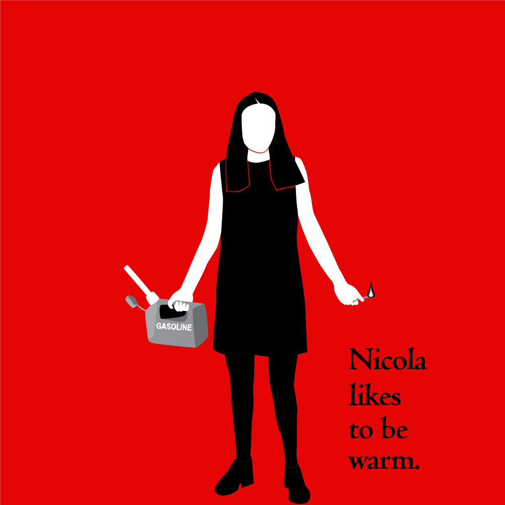
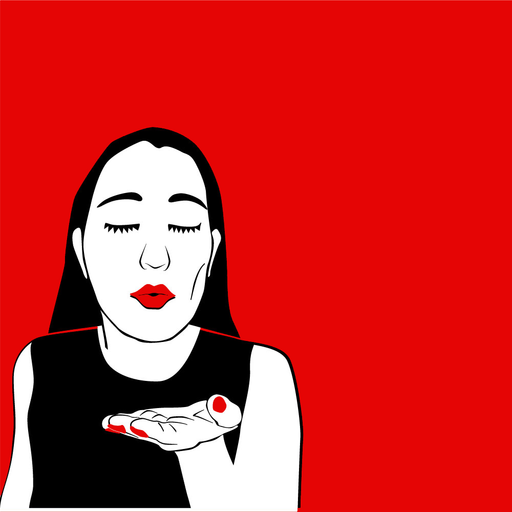
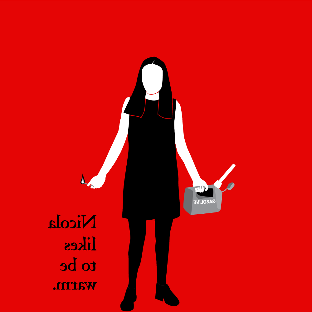
First I blended Images 1 and 2 only.
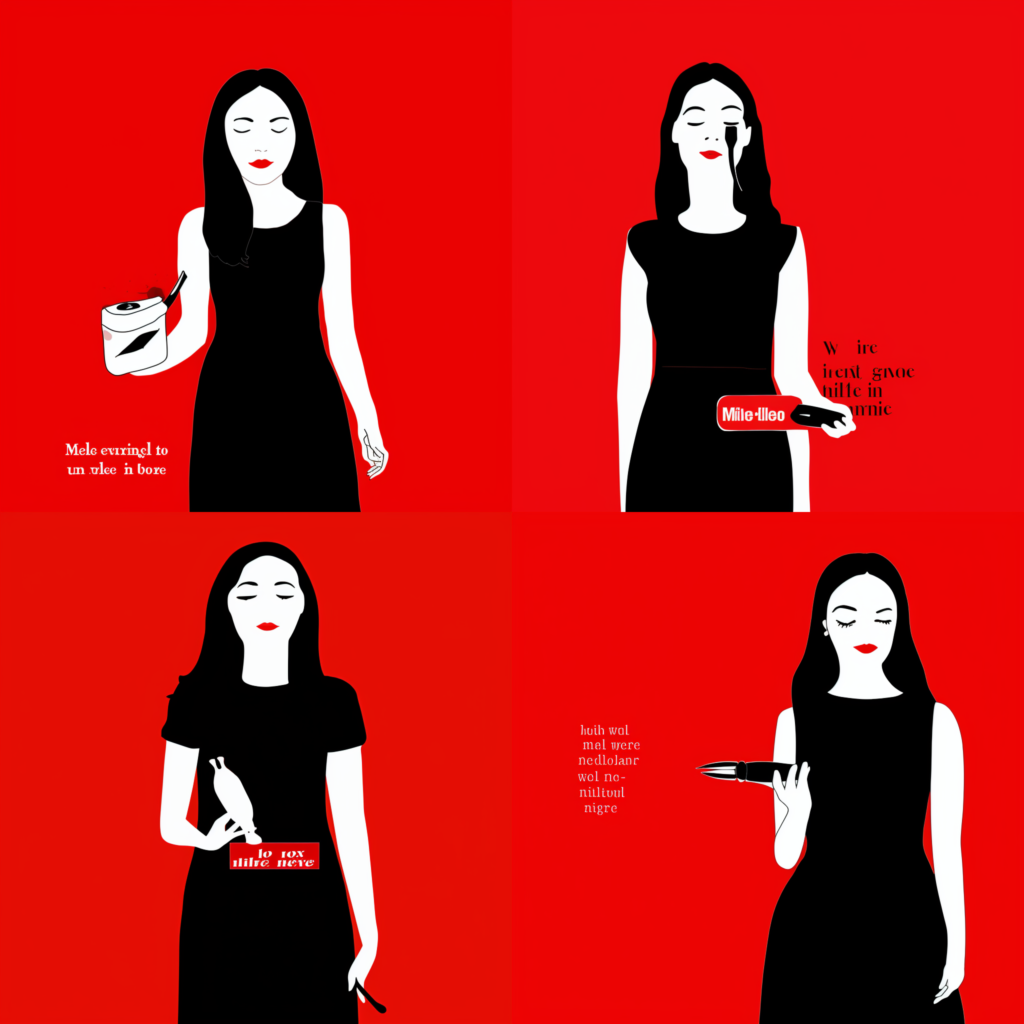
For the blended images, Midjourney kept the black and white of Image 1, but had a darker red and mostly used the composition of Image 2. It did make an attempt at type, to match Image 1, and showed the figures to below the waist.
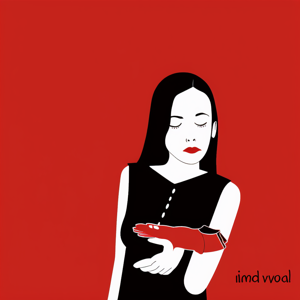
Midjourney’s most successful blended image.
Wins:
- The face has symmetrical, attractive features and a neutral expression.
- The body has a similar posture to that of Image 2.
- The body is shown to below the waist, a combination of Images 1 and 2.
- The stylized eyelashes were matched.
- Black text on the right side.
Fails:
- The left hand has six fingers and isn’t held up for blowing a kiss.
- The red fingernails have been replaced by a floating red glove.
- The left arm ends at the elbow.
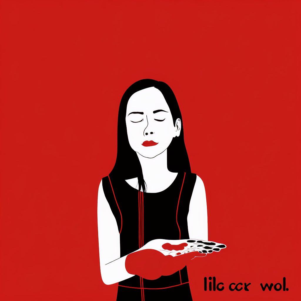
Somewhat less successful.
Wins:
- The colors match Images 1 and 2.
- The body has a similar posture to that of Image 2.
- The body is shown to below the waist, a combination of Images 1 and 2.
Fails:
- The face has less symmetrical features and a pained (non-neutral) expression.
- The left hand and red fingernails have been replaced by a floating red mass.
- The right hand is distorted and has elongated black ovals replacing the fingernails.
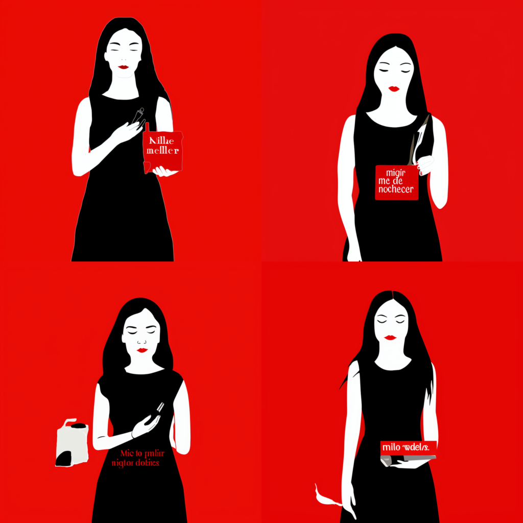
Then I blended Images 1, 2 and 3, to give more weight to the standing figure.
Midjourney won’t let you upload the same image twice so I flopped Image 1 to produce Image 3. Here’s what I got.
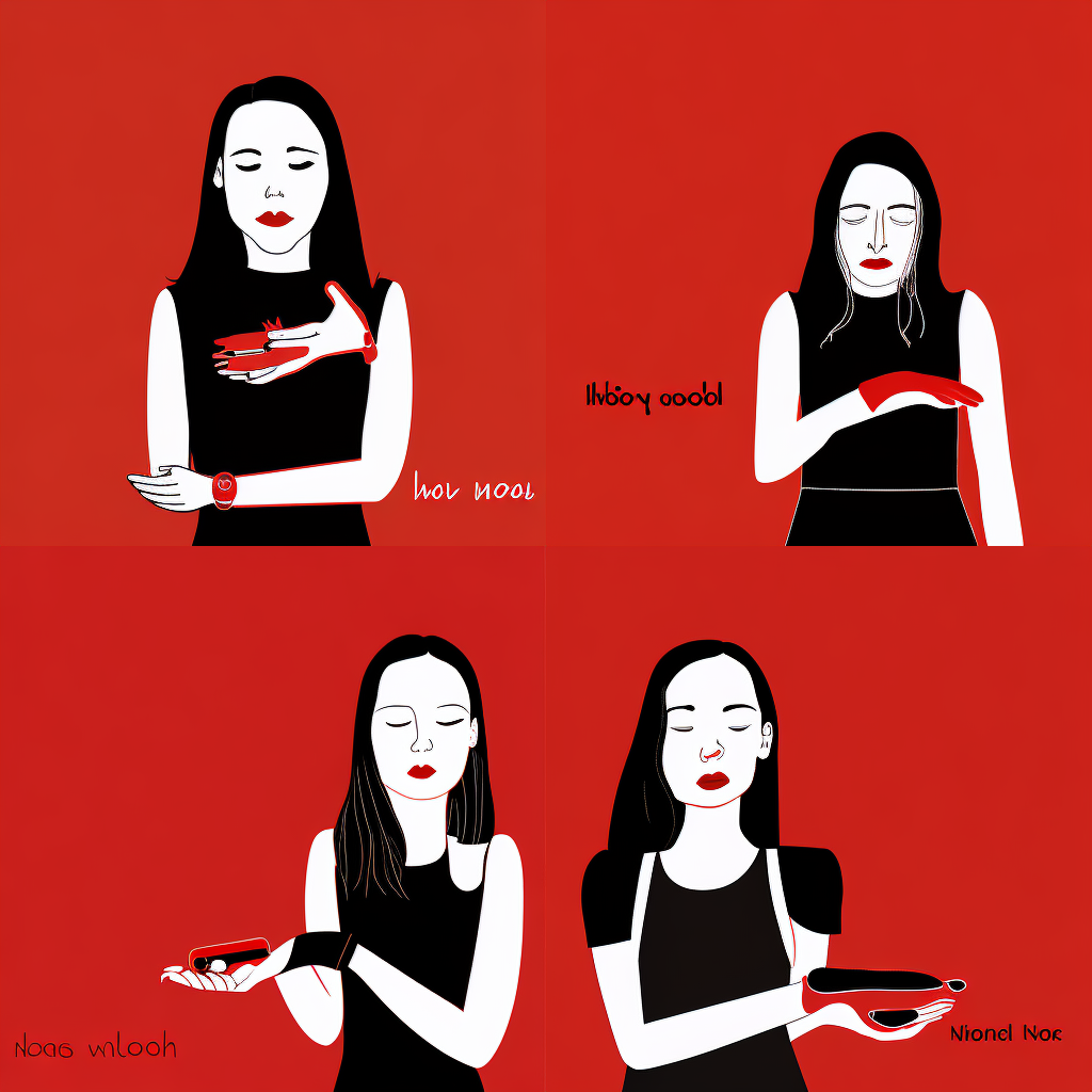
More distorted.
Wins:
- The colors match Images 1, 2 and 3.
- The bodies have a similar posture to that of Image 2.
- The bodies are shown to below the waist, a combination of Images 1, 2 and 3.
Fails:
- The faces have less symmetrical features and some have a pained (non-neutral) expression.
- On each, at least one hand is raised, but none matches Image 2.
- There is black or white text on the right or left side.
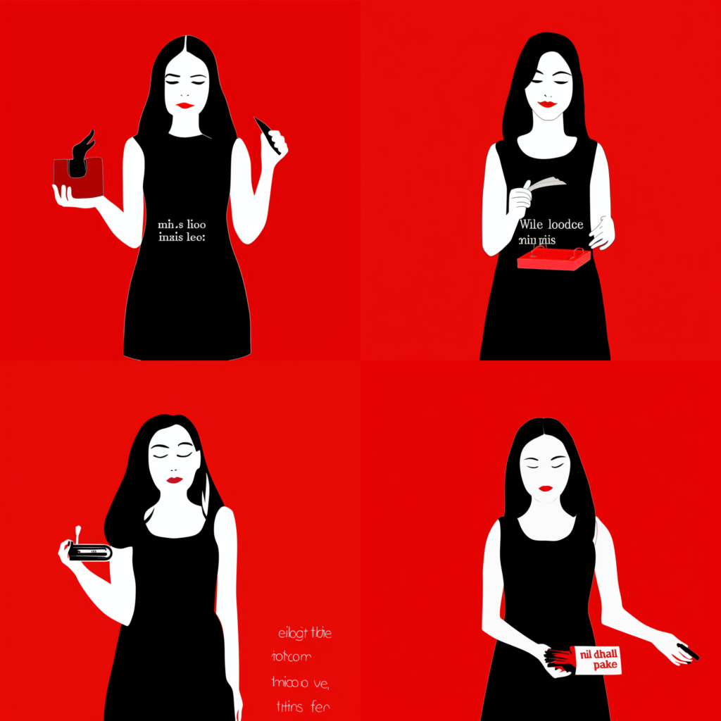
Less distorted but with elements added.
Similar wins:
- The colors match Images 1, 2 and 3.
- The bodies have a similar posture to that of Image 2.
- The bodies are shown to below the waist, a combination of Images 1, 2 and 3.
- The faces have symmetrical features and neutral expressions.
- One figure has text to the right side.
Fails:
- Suddenly, the figures are holding random objects.
- There is red or white text on the figure or the object in the hand.
Conclusions
- Midjourney is OK but not great at blending images.
- Midjourney recognizes the faces and hands in my illustrations, but is less good at rendering them. Midjourney has trouble with faces and hands in general, but even more so when the images are not photographic.
- Midjourney suuuuucks at rendering type. We knew this already but this exercise is just more more confirmation.
More Midjourney attempts below
