An interesting article by UK layman Peter Irons from his blog, “To Read or Not to Read: This Blog will chart the progress of the emergence of the use of computer screen technology to enable more people to maximise their reading performance across the world.”
In his blog Irons explores reading deficits such as dyslexia, especially in children, and how they may be best ameliorated. Here he comments on a Harvard study about children’s relative reading speed and comprehension on e-readers as opposed to in print. All emphasis and text colors are that of the author.
Comments on an article from Harvard about e-readers and dyslexia. A visual component acknowledged in the USA!
I have been thinking a great deal about the ‘research’ that has come out of Harvard recently.
The abstract I reprint below. This research has been published on PLOS ONE, a peer reviewed, open access journal. The original article makes very interesting reading especially in the context of the USA where to even imply the possibility of a visual component in dyslexia can bring down the ‘wrath of the IDA’!
After re-reading the original article, which I commend everyone to read, the conclusions seem a bit guarded. I have highlighted components of the abstract which I feel need much more consideration.
E-readers are fast rivalling print as a dominant method for reading. Because they offer accessibility options that are impossible in print, they are potentially beneficial for those with impairments, such as dyslexia. Yet, little is known about how the use of these devices influences reading in those who struggle. Here, we observe reading comprehension and speed in 103 high school students with dyslexia. Reading on paper was compared with reading on a small handheld e-reader device, formatted to display few words per line.
We found that use of the device significantly improved speed and comprehension, when compared with traditional presentations on paper for specific subsets of these individuals: Those who struggled most with phoneme decoding or efficient sight word reading read more rapidly using the device, and those with limited VA Spans gained in comprehension. Prior eye tracking studies demonstrated that short lines facilitate reading in dyslexia, suggesting that it is the use of short lines (and not the device per se) that leads to the observed benefits. We propose that these findings may be understood as a consequence of visual attention deficits, in some with dyslexia, that make it difficult to allocate attention to uncrowded text near fixation, as the gaze advances during reading. Short lines ameliorate this by guiding attention to the uncrowded span.
In the actual paper, they state that they were comparing reading performance on a font 14 in the print with font 42 on the e reader.
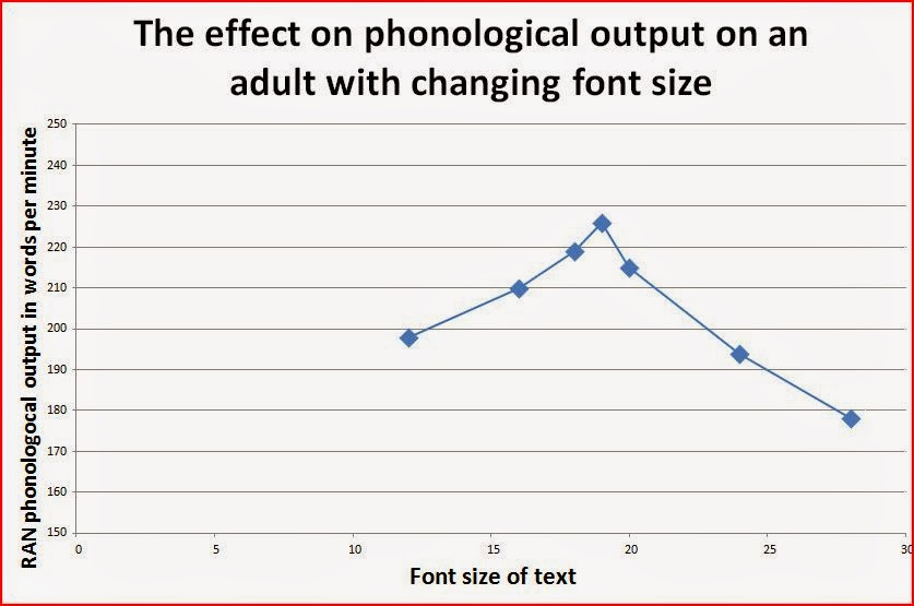
Now don’t get me wrong, but perhaps they should have looked at other font sizes on paper? They did say that the e reader allows accessibility options so really they were not really looking at e readers, but at font size. If you read other postings in this blog, this would not surprise you at all. The graph on optimal font size for an individual shows the critical importance of font size.

Each individual appears to have an optimal font size. For most students in the UK which myself or my colleagues have seen it is far greater than font 14, the default used on the printed task.

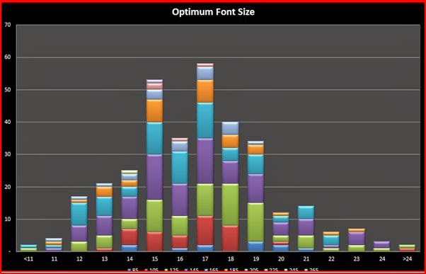
The ‘pretty’ graph above shows how the optimal font size varies in a population of dyslexic students. The modal size is font 17. About half the students need a font greater than this. Very few though benefit from a size greater than 24. This data is collected from students who have full optometric correction. The range of font optimal font sizes will reflect issues such as…
- Crowding effects associated with cone cell size.
- Diffraction issues associated with corneal problems
- Other low vision issues not correctible by optometrists.
In other postings there are graphs showing the effects on reading performance of
- Changing the background brightness to the text for individuals
- Changing the relative brightness of the red, green and blue pixels.
These effects will be affected by the individual’s working cone pigment densities, how quickly the epithelial cells they are plugged into can re-activate the pigment molecules after they are bleached, as they read as well as the ability of the individual’s iris to dilate and constrict to optimise the rate at which the pigments in general are being bleached. I could even ‘hypothesize’ that changing the relative stimulation of the red and green cells, which is the basis of foveal edge detection, will change the rate of data transfer about those edges to the visual cortex. I challenge anyone to explain it differently!
As such for each individual there would be a specific ratio which sends the most data per millisecond and this would provide the best provision of data for phonological processing, and ‘gaze’ management.
But I am not a Harvard researcher. So I will have to wait until they catch up.


