A glorious number of type designers have created fonts based on the Fibonacci spiral. Some of the designs are lovely, such as Sarah Samira’s, some are incomprehensible, such as Nicola Ball’s, and some are just terrible, such as Rachel Sinclair’s, but it’s the (mathematical) thought that counts.
Fibonacci Font—Sarah Samira Design


The Fibonacci Spiral

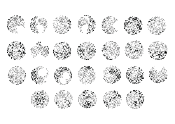
Fibonacci Font—Nicola Ball
Nicola Ball is a third year graphic design student at Salford University, and lives in Manchester, UK. Behance link.
She used Fibonacci patterns in her creation of the Turing alphabet (2012), named in celebration of Alan Turing’s 100th birthday.
Written by Luc Devroye
McGill University
Montreal, Canada
lucdevroye@gmail.com
http://luc.devroye.org
Up to main font page
Up to main font index page
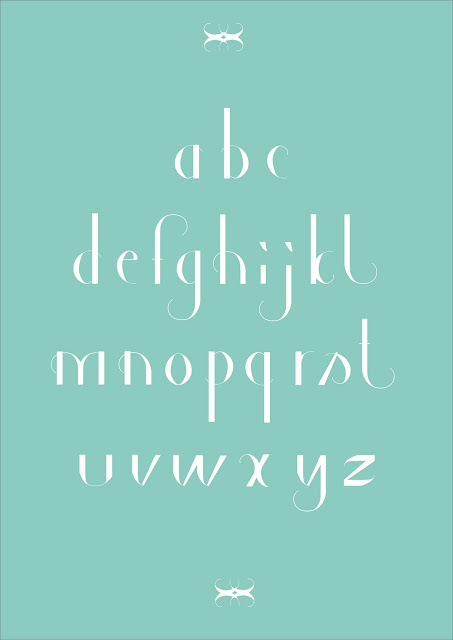
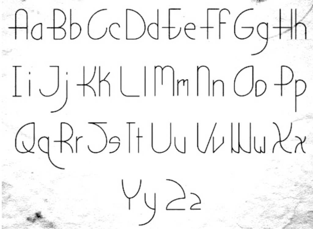
Fibonacci Font—Rachel Sinclair
Rachel Sinclair, illustrator and fine artist in Louisville, KY, confesses to many art nouveau influences. Her only entrance in the world of type design thus far is her typeface Fibonacci (2011), which is based on the golden ratio and the so-called Fibonacci sequence. The curves of the Fibonacci spiral inspired the shapes of the glyphs in the font, and magically, it has an art nouveau look because of it.
Written by Luc Devroye
McGill University
Montreal, Canada
lucdevroye@gmail.com
http://luc.devroye.org
Up to main font page
Up to main font index page

