Clever font sneaks pronunciation guide for English speakers into Japanese katakana characters
By Casey Baseel from Rocketnews24:
Written Japanese uses three kinds of script. At the top of the difficulty curve, you’ve got kanji, the complex characters originally imported from China that can require over a dozen brush strokes to write, with each kanji representing a word or concept.
A little less challenging are hiragana, a set of 50 curving phonetic characters, but if English is your native language, odds are you’ll have the least trouble with angular katakana. Like hiragana, katakana is a phonetic system, so each character corresponds to a syllable. Even better, while often one kanji can have three or four possible readings, each katakana has just one possible pronunciation.
Of course, you still have to memorize how to pronounce all 50 katakana (85 if you’re being really technical) in the first place. One group of graphic designers are aiming to make that task a little easier, though, with a font that combines katakana with phonetics written in English.
Employees of U.K.-design house Johnson Banks often come to Japan to work with clients. Japanese is a tricky language to learn, though, and even after multiple trips to the country, the business travelers weren’t going to just naturally pick up the ability to read katakana.
It’s not too surprising that professional designers are visually oriented people, and so Johnson Banks spent several months developing a new font where an English rendering of each katakana’s sound replaces a brush stroke in whole or part.
For example, here’s the name of Uniqlo, beloved outfitter of exchange students and Internet writers, as it looks in katakana.

And here it is rendered in Johnson Banks’ new Phonetikana font.

Katakana is primarily used for foreign loanwords, and we can see a few more artistic flourishes in these designs that the company drew up, possibly before lunch.
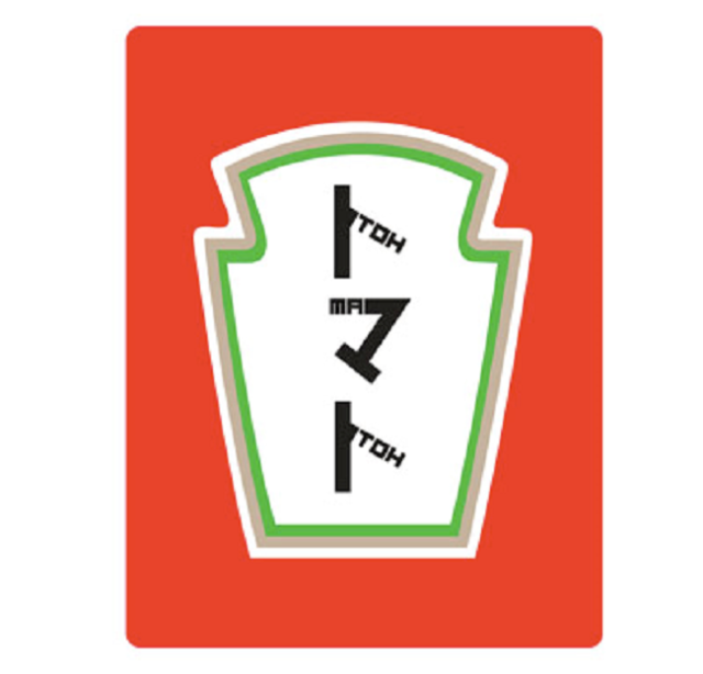
▼ tomato/tomato
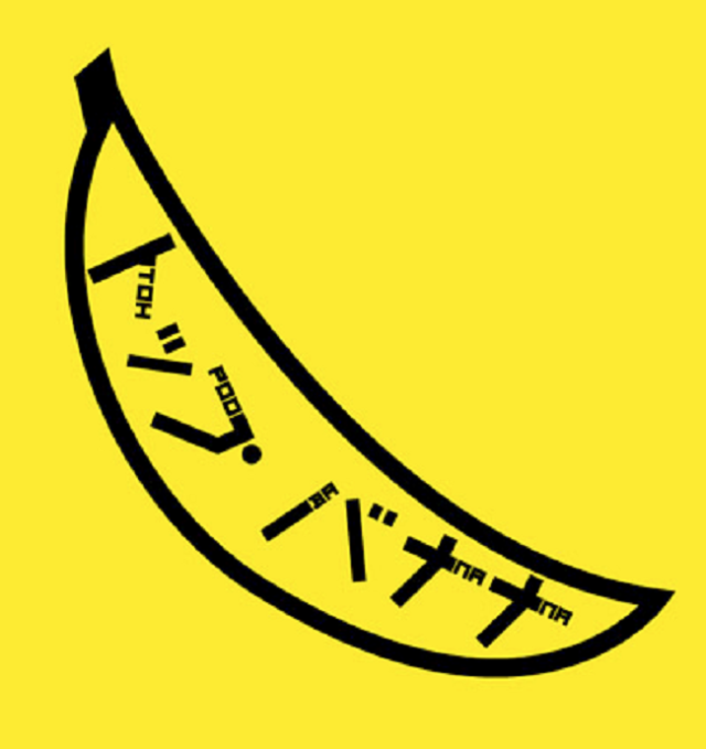
▼ toppu banana/top banana
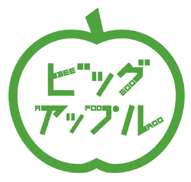
▼ biggu appuru/big apple
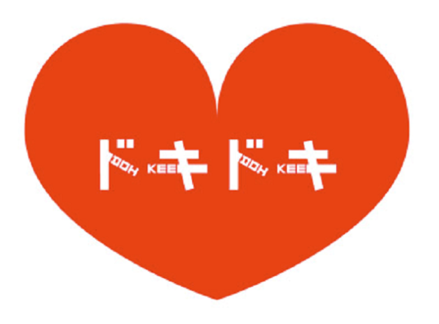
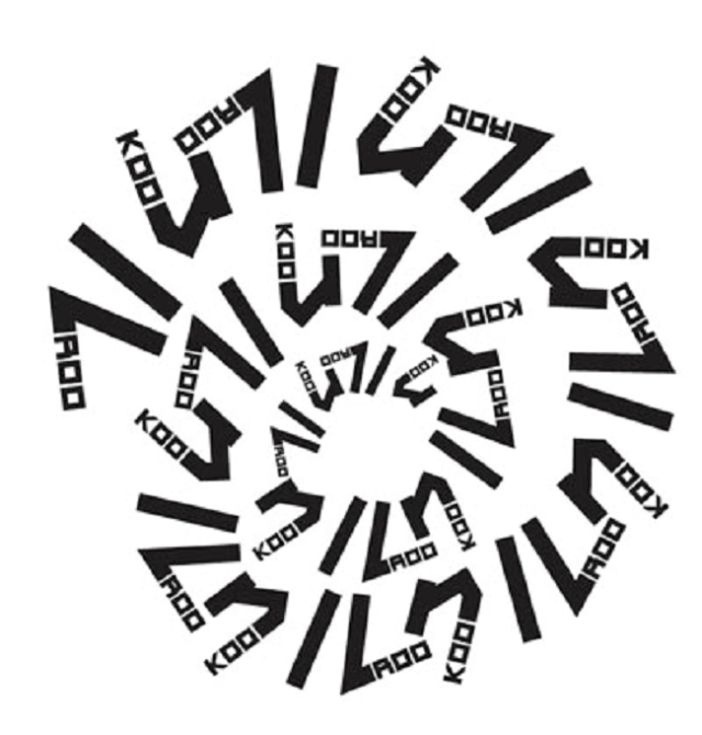
Aside from words of foreign origin, katakana is also often the go-to choice when writing sound effects, onomatopoeia, and comic book-style action words, such as doki doki, the sound of an excited heartbeat…
…kuru kuru, spinning or spiraling…
…or niko niko, indicating that someone is all smiles.
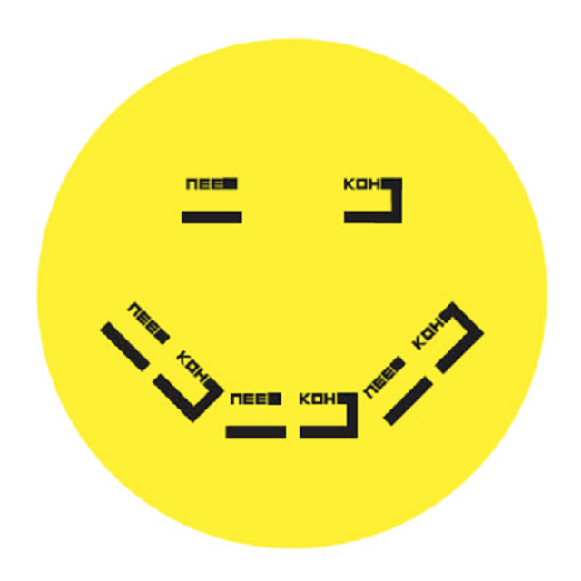
In a way, this linguistic mashup is a really clever idea, and with a few tweaks, it might actually be an easy way for brand new learners to dip their toes in Japan’s deep linguistic waters. What kind of tweaks? Well, let’s take another look at niko niko.

Notice how we’re spelling it differently than Johnson Banks does?
It’s true that there are a couple of different systems for writing Japanese words in the Latin alphabet, but there’s one method that’s by far the most common, and it says the Japanese syllable that sounds like the English word “knee” should be written “ni,” not “nee.” As a matter of fact, under the dominant system, “nee” would be pronounced like “neigh,” the sound a horse makes.
As a further example, let’s take a look at what happens to “sushi” in Phonetikana.
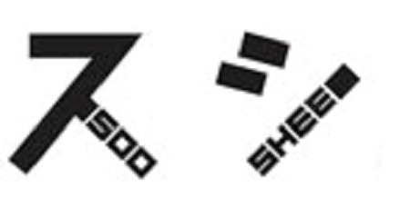
You end up with “sooshee,” which aside from looking weird, makes those two syllables seem a lot longer than they really should be. That’s a problem you’re a lot less likely to run into with the standard “sushi.”
Still, Johnson Banks says the font is a work in progress, and is looking for feedback from linguists. We’re wishing them good luck in ironing things out, and looking forward to Phonetikana Version Two.
Sources: Tabimedia, Johnson Banks
Images: Johnson Banks


