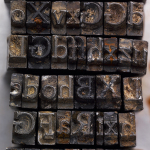
With regard to the surreptitious disposal and triumphant recovery of the Doves Type from London’s Thames River (from an article in typespec magazine): The Doves Type® revival. Not to be confused with my post Found Font Friday 2, about fonts created from lettering and signs found in the great outdoors.
Raised from the dead: The Doves Type story.
The Doves Type legend is one of the most enduring in typographic history and probably the most infamous. It’s the story of a typeface and a bitter feud between the two partners of Hammersmith’s celebrated Doves Press, Thomas James Cobden-Sanderson and Emery Walker, leading to the protracted disposal of their unique metal type into London’s River Thames. Starting in 1913 with the initial dumping of the punches and matrices, by the end of January 1917 an increasingly frail Cobden-Sanderson had made hundreds of clandestine trips under cover of darkness to Hammersmith Bridge and systematically thrown 12lb parcels of metal type into the murky depths below. As one person so aptly commented on Twitter recently, this notorious tale bears all the hallmarks of a story by Edgar Allan Poe.
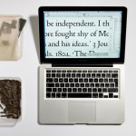
One century later and a new chapter has been added with the release of Robert Green’s digital facsimile of the Doves Type, available to buy and download from Typespec. For those who are still unfamiliar with the historical background and the designer’s arduous journey to salvage this beautiful typeface from its watery grave I would urge you to check out the following short BBC News film by Tom Beal, made after the recovery in 2014 of some of the original type from the Thames:

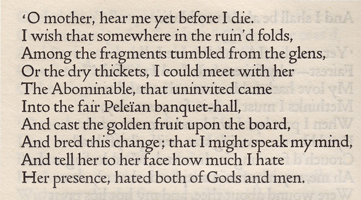
The original Doves Type was crafted by master punchcutter Edward Prince, based on drawings produced by Percy Tiffin of Nicolas Jenson’s pioneering 15th-century Venetian type. William Morris, founder of the Kelmscott Press, had actually developed his own ‘Golden’ type some years before The Doves Press came into being but Doves is held by experts as being more faithful to the original Venetian letterforms.
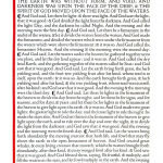
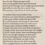
The Doves Type was commissioned in 1899 and created solely by Prince in 16 pt; it was used in all of the press’s publications including their iconic edition of the King James Bible. Each Doves Press book was beautifully bound and, notes Green, noticeably “stripped of decorative borders and illustration, the elegantly clear & legible type acting alone as visual siren-song.”

By 1908, despite successful Milton prints & the aforementioned Bible, the Press was in dire financial difficulty. Subscribers began melting away after Walker had effectively left in 1906 as the bitter & acrimonious dispute took hold between the partners. On finally dissolving their partnership in 1909, Cobden-Sanderson began attempts to wriggle out of an earlier promise that, should the partnership cease, Walker would receive a fount of type ‘for his own use’. Walker retaliated, issuing a writ insisting that the Press shut down completely and he receive 50% of remaining assets. In 1909, the Press’s only valuable asset was the type.
A compromise was reached, brokered by their exasperated friend Sir Sydney Cockerell, which allowed Cobden-Sanderson uncontrolled use of the type for as long as he lived, at which time it would pass to Emery Walker, if he did not die first.
The thought of ‘his’ typeface being used by anyone else, and in a manner beyond his control, prompted Cobden-Sanderson’s now infamous course of action. Only the Doves Press, run exclusively by him, could be bestowed the honour of printing his type. And so the mission to destroy it, beginning with the punches and matrices on Good Friday 1913, began. On an almost nightly basis from August 1916 the ailing septuagenarian dumped the type into the Thames, wrapped in paper parcels and tied with string; “bequeathed to the river” as he put it in his personal diary. Every piece of this beautiful typeface, more than a ton of metal, was destroyed in a prolonged ritual sacrifice.
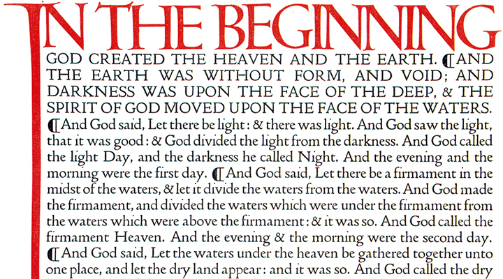
Green’s quest to re-produce the Doves Type in digital form has been a true labour of love, a project he came close to shelving on several occasions due to the paucity of (affordable) source texts and occasional blind alleys he was inadvertently taken down. Much agonising took place over the general approach to the project, deciphering the complex geometries, then individual letterform dilemmas due to ink spread inconsistencies and anomalies in the punches and matrices. The end result isn’t so much a revival as a ‘digital facsimile’ of the original typeface, but most importantly he’s succeeded in doing justice to it.
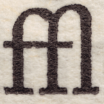
The first release (2013) in OpenType format was an Imprint weight, complete with ligatures and detailing from the metal predecessor; Green wanted to be as true to the original as possible but there are concessions to modern day requirements in the form of Dollar & Euro currency symbols plus extended latin diacritics which didn’t feature first time around.
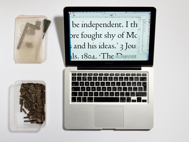
Doves Type® Regular, refined after recovery of the original metal type from the Thames, replaces the initial 2013 release, improved in 2016 for contemporary usage. This latest release of the updated Doves Type® contains extended glyph coverage including small caps, together with both lining and tabular figures. Tracking and kerning have also been adjusted for 21st century usage. The original Doves Press type, cut for letterpress with its physical constraints and inherent quirks, contains spacing which would appear uncomfortable to modern eyes in web-based and litho applications.
Go to the font download page for more details and to buy the font(s).
![]() Download a free Doves Type® PDF specimen (1.5MB).
Download a free Doves Type® PDF specimen (1.5MB).
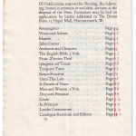
Click on a thumbnail below to browse a gallery of larger Doves Type images.

