This font will make your brain hurt
Oxymora is a typeface that evokes the twisting, non-Euclidian geometry of MC Escher’s artwork
By Carl Franzen
Impossible, twisting geometric artwork abounds across the internet (see The Verge‘s logo for one prominent example). So it seems high time that someone made a similarly reality-defying font. “Oxymora” is it, transforming the familiar forms of English letters into bizarre, spatially confused 3D blocks that make your brain hurt. It was created by Barcelona-based illustrator and designer Birgit Palma, who says she was inspired by the work of brain-teasing artist MC Escher. As she tells us:
Actually I admire Escher’s work a lot and use him quite often as reference. I feel that the solutions he offers are extraordinary and go beyond normal graphic design. When a client came to us and asked us to reinterpret the word MAX in a graphic way I immediately got fascinated by the fact that all the letters symmetrical. The symmetry and Escher’s impossible figures were the base to develop the two different views of each letter and merge them. The project itself wasn’t realized in the end, but I got so addicted by the system that I decided to make a complete font out of it.
Oxymora will soon be published as a display font by Ultratypes. It’s probably not the best font choice for your average document, but if you’re looking to leave an impression, Oxymora will do the trick and then some.
See some examples of the characters below:
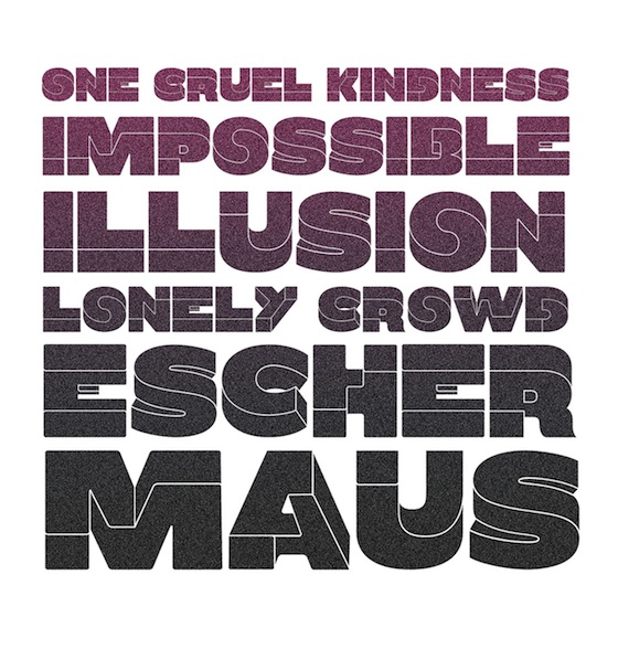

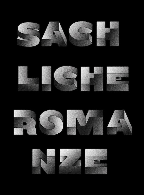
All images courtesy Birgit Palma.
- Via Fast Co Design
- Source Cargo Collective Inspiration Hut
- Image Credit Birgit Palma/Inspiration Hut
- Related Items font 3d typeface geometry mc escher oxymora non-euclidian geometry birgit palma

