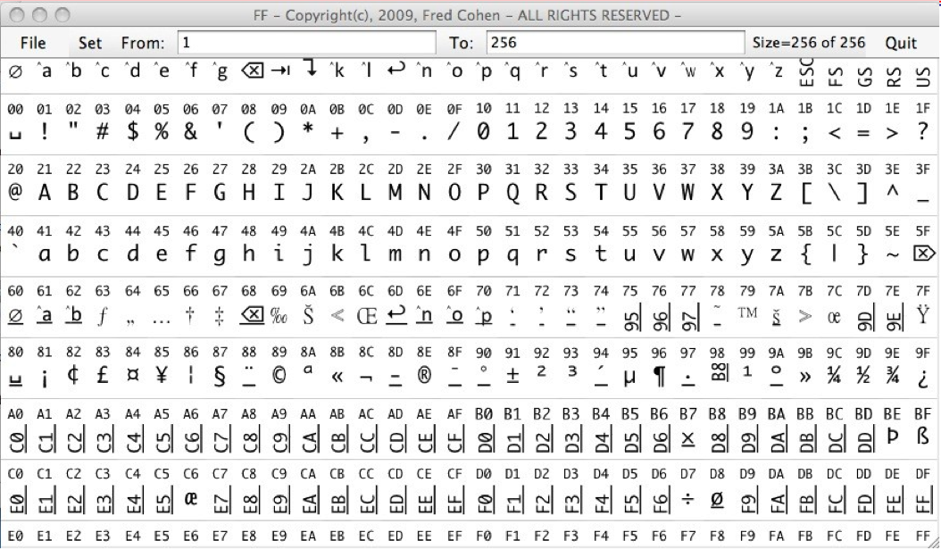
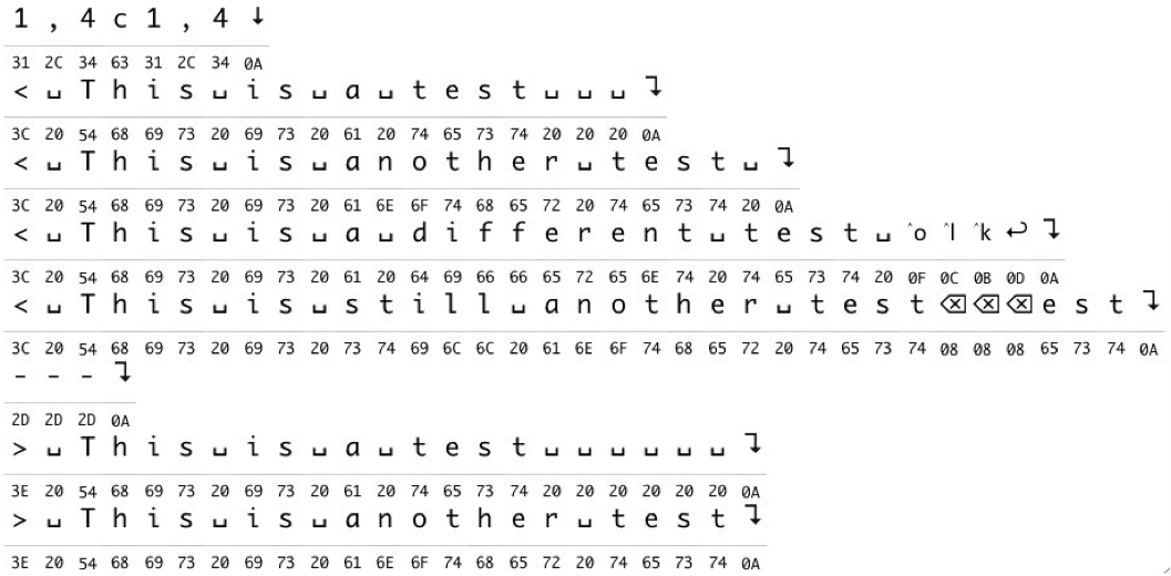
Forensics professionals pay a great deal of attention about what fonts to use in courtroom exhibits concerning or reproducing digital evidence. To quote a paper by Fred Cohen & Associates of the California Sciences Institute [abstract below] “fonts for forensics are less about the beauty of the presentation and more about the tradeoff between readability and being definitive about what is present.” Specifically, from a presentation by Cohen at SADFE, the Systematic Approaches to Digital Forensic Engineering in 2010:
- Each symbol must be clearly different and readily distinguishable from all other symbols
- Each symbol must be displayable and printable so that a <space>, <tab>, <carriage-return>, <backspace>, <escape>, and other “non-printable” characters can be clearly seen on the printed page and on other displays
-
Each symbol should be familiar, with minimal added interpretation, so that it looks similar to what might appear on a display of the same symbol on a screen or printer in normal use.
-
Each symbol should be able to be depicted so as to self-indicate the underlying bit pattern that produced it, so that it can be traced back to its original value.
-
Each symbol should be depictable in the same width and height
Regarding Forensics Font™, the character set Fred Cohen & Associates have developed, Cohen says, “In examining [an application of the font], I found that it was consistent with the ‘ASCII’ character set.” I.e. their product is widely usable and useful.
A longer paper by Cohen on forensic fonts can be found here.
Abstract
Like other latent evidence that cannot be directly perceived by people, bit sequences have to be presented through tools. Presentations of digital forensic evidence often involve the presentation of text versions of bit sequences representing traces of events that took place within digital systems. This paper is about creating fonts for the examination and presentation of particular classes of bit sequences presented in particular ways in legal situations. Unlike fonts used for other purposes, fonts for forensics are less about the beauty of the presentation and more about the tradeoff between readability and being definitive about what is present. In other words, what you see is what you get, rather than what you see is what looks nice.


2 Responses
I love Font Friday. I always learn something. Like that there are forensic fonts. Who knew? You did. Thanks for sharing your knowledge.
Thanks Nancy! I love *doing* Font Friday–there’s so much cool font material out there. The only hard part is figuring out how to make the headline start with “F” or “Ph”!