From Yves Peters at fontshop.com on December 14, 2015 (revised December 20, 2015): An exhaustive article on the various versions of the fonts for the “iconic opening [text] crawl” and posters for each Star Wars movie!
To say a whole lot of people are getting a whole lot of excited about Star Wars: The Force Awakens which premieres in Los Angeles today is kind of an understatement. More than just a new installment in the insanely popular franchise, the new film by J.J. Abrams seems to be bringing back many elements from the beloved original trilogy, one example being the dirtier, shabby version of machinery and technology. And then there is the return of some familiar faces we never dared hope to see again, like Princess Leia, Han Solo and Chewbacca. However there is one familiar face whose return went largely unnoticed to anyone but us type geeks – the ITC Serif Gothic® typeface.
The Original Trilogy: ITC Serif Gothic, the Star Wars logo, and Times

“A long time ago in a galaxy far, far away…” This line – one of the most well-known sentences in pop culture – has left an indelible mark in our collective consciousness. It precedes the iconic opening crawl at the beginning of the epic space opera: an introduction that sets the story for each film. The sight of the yellow text – set in the Trade Gothic® typeface – disappearing into the far reaches of space is guaranteed to send shivers along the spine of any self-respecting sci fi aficionado (unless they’re a Trekkie of course).
Those famous words also found their way on the poster for the original 1977 movie (which revisionist young punks insist on calling Episode IV – A New Hope) with classic artwork by Tom Jung. While the logo was custom-drawn by Ralph McQuarrie in a blocky sans serif mimicking the perspective of the opening crawl, the tagline and credits were set in ITC Serif Gothic.


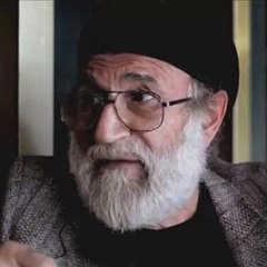
Antonio DiSpigna
By the time the Empire strikes back in 1980, Antonio DiSpigna’s geometric glyphic sans has disappeared from the promotional materials. After it already had been featured at the beginning of the opening crawl and on the teaser poster for the first movie, the classic Star Wars logo finally shows up on the main theatrical poster – again with an illustration by Tom Jung. Originally designed by Suzy Rice, the logo was revised by Joe Johnston, and then outfitted with a new ‘W’ by Rice again. On this poster it is integrated into a border running around the movie title. The somewhat awkward shapes of the ‘R’ and the two ‘S’s make it seem as if they were specifically drawn for this purpose, because they connect seamlessly to the lines of the frame. The tagline was probably hand-lettered in a heavy sans serif style based on the Star Wars logo; the credits are set in the ITC Avant Garde® Gothic typeface, another ’70s stalwart.

When we witness the return of the Jedi three years later (seriously, he sure took his sweet time) there is a noticeable shift in typographic voice. Gone is the punchy sans serif often associated with action movies, and the designer wanders into more epic territory to complement the lush artwork by Kazuhiko Sano. Yet we are still only 6 B.T. (before Trajan™) as the original release of the Adobe Originals program is another six years away. In the absence of a better option the movie title ends up being set in the Times typeface with an elongated tail on the ‘J’. Taken out of the context of the stacked lock-up of the original logo or the frame in the poster for The Empire Strikes Back, the Star Wars logo itself now looks even more awkward, with the leg of the first ‘R’ and the top of the final ‘S’ aimlessly poking into nothingness.
The Trajan Menace


The prequels that make up the second trilogy were released around and right after the turn of the millennium. This time around the marketing collaterals go full-blown epic. The legendary Drew Struzan delivers majestic artwork in his signature style. 15 years ago the Trajan™ typeface was still the poster child (pardon the pun) for grandiose film sagas, so its appearance on the posters is self-evident. The supporting typeface is Albertus®, which my research as a follow-up to the conversation I had with Toshi Omagari revealed to be one of the main precursors to Trajan. Both typefaces share dignified, chiseled looks that are enhanced by the addition of gradients and bevels. The Star Wars logo itself gets the shiny metal treatment.
Return of ITC Serif Gothic

And now, almost four decades after our first encounter with the Force, we witness the return of ITC Serif Gothic in the main logo for Star Wars: The Force Awakens. Unfortunately this is not your parents’ ITC Serif Gothic.

I tried to emulate the original tagline as well as I could using the ITC Serif Regular font, with -75 negative tracking for that typical 70s ‘tight but not touching’ look. I applied -125 negative kerning to neatly tuck the elipsis underneath the arm of the ‘y’, and added +35 to the right side of the ‘t’ to detach it from the ‘i’. Yet this could only get me so far. Several characters are different – the Elsner+Flake family is the only one to have the correct ‘t’ with a tail, but no digital version features the double-storey ‘a’, the ‘e’ with slanted crossbar, nor the ‘f’ with elongated tail. Because most ITC fonts from that era were display faces, they were decked out with numerous alternate glyphs for maximum versatility. This allowed designers to fine-tune the lock-up until it was just right. Sadly almost none of those extras made it to digital. It is about time someone revisited ITC’s advertising classics and restored them to their original glory.
As for the movie itself – don’t spoil it for me! – I cannot wait to watch it to see if there are any other typographic treasures to be discovered. The poster itself will definitely be discussed in the January 2016 edition of ScreenFonts.
For more Star Wars-related typographic goodness, read about the history of Suzy Rice’s original Star Wars logo design on Episode Nothing, and about the little-known pre-release version by Joe Johnston on Fonts In Use. And if just like me you are intrigued by typography in science fiction movies, go over to Typeset In The Future, Dave Addey’s excellent blog dedicated to fonts in sci-fi.
Star Wars fans are a passionate bunch, and you are guaranteed to always find a bigger geek than yourself. This article was updated and corrected on December 20, with contributions by Ness Steadman, Richard Palermo, and Stephen Coles.
Trademark attribution notice
ITC Serif Gothic and Avant Garde are trademarks of Monotype ITC Inc., registered in the U.S. Patent and Trademark Office, and which may be registered in certain other jurisdictions. Trade Gothic is a trademark of Monotype GmbH, registered in the U.S. Patent and Trademark Office, and may be registered in certain other jurisdictions. Albertus is a trademark of The Monotype Corporation, registered in the United States Patent and Trademark Office, and may be registered in certain jurisdictions. Trajan is a trademark of Adobe Systems Incorporated which may be registered in certain jurisdictions. All other trademarks and copyrights are the property of their respective owners.

