An excellent rant from a developer who’s sick of designers using “cool” but unreadable web fonts. Written in 2012, so many advances have been made since then towards getting cool type to be readable (e.g. Google Fonts), but the point stands.

Web font rant, forgetting the point of a website
This is just a rant I wanted to have about designers, web fonts and the choices they make. Seems people are putting design before content.
I’ve noticed a bit of a trend in the last year. Lots and lots of new bizarrely named fonts are springing up on designer sites left, right, and center. It’s nice to see, new tech being used and tried out. I’ve got a few issues with it though…
Namely a lot of the time it’s using odd fonts for the sake of it, for being a bit different, for showing off that you know how to use Typekit (other font system are available). That is kind of ok on a design blog or personal site, it’s your site and you probably just want to stretch your legs and show off a bit, why the hell not.
Trouble is I worry that this use of new/custom fonts will quickly spread, you’ll be itching to start using on a client’s website. You’ll start using nice anti-aliased fonts in your mock ups in the hope you can actually use them on the build.
On the subject of mock ups (side rant)
By the way, anti-aliased fonts on mock up is the devil’s work, and one of the fastest ways for a designer/agency to get on our “never buy a pint for” list. The only loophole to that rule is if you are building the site yourself, and are prepared to accept the pain you are bringing onto yourself.
95% of the time though you are just conning your client by showing them a nice printout of something that won’t look anything like the final build. It will be full of Mac form niceness and all. This is simply so you increase the chance of the client, who knows no better, liking its “great design and cleanness” and hopefully awarding you the contract. Probably over a rival who has done the decent thing and presented a “true” website representation with standard web fonts and form elements, so the client won’t be sold short when they deliver. Also by doing that you’ve cursed the developers/production team who have to build your dream mockup to constantly repeated verses of “this does not look like the mockup” conversation with each new level of stakeholder as the site progresses to completion, each one needed to be filled in about fonts, browsers, not our design, manage expectations… Thanks.
Back to web fonts…
I don’t want designers using them on client sites, I don’t really want you using them on your site (as it might be full of nice content I want to read). Why? Well it’s simple, I have a really hard time reading text written in crazy fonts. You are putting the “aww that looks lovely” feeling in front of the “ahh that’s nice to read, and it looks quite nice too” feeling. It’s the content that counts—the pretty stuff should be second.
We’ve been guilty of it ourselves—the first build of this blog has a font on it that looked great, but was next to unreadable, so we changed it. However, as a result of this post, I’ve just changed it again to use default web fonts on the main blog post content, as it was still hindering readability.
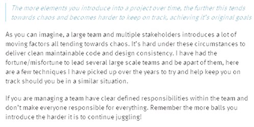
What sparked this was when James (@welcomebrand) tweeted about an article about building large production websites he liked the sound of which I went to go read, this is how it looks on my screen though:

I can read it, but it just takes so much more effort to read it than it should! So much so that I stopped reading. It looks blurred, it looks like it’s in a font size that the font does not support, so it’s half guessing what it should be to try to find some happy medium, but failing. It’s not nice.
My brain only has so much processing power (some would say mine has less than most, I call these people friends believe it or not), limiting how much is needed to be spent on reading means I have more available to think about the content which is the purpose I’m here on your blog, after all. Limiting noise and additional work for my brain to do means more thought can going into what I’m reading and not just how it’s displayed.
Here’s a trick to try. If you drive and have had a hard day or struggling to concentrate try driving with the sunvisor down. Do this even if it’s cloudy or even at night. You instantly reduce the amount of visual information coming into your brain by about a third. This means you’ve got about a 1/3 more concentration to focus on the road, nice, safe and less tiring. When you try it you can almost hear your brain thanking you and spinning down a bit. Reading a website is no different, it’s the reason plugins to stop flash banners, gifs, etc. exist. It’s hard to read with all those distractions. These fuzzy fonts are no different. They waste brain power.
I had to edit the CSS in my browser to kicking it back to sans-serif just so I could read it;

Even excusing the horrid screenshots (which do lose a little crispness) how much better/clearer does that look? What is the original top font adding that the bottom is losing? I’d say nothing but damaging the readability, which after all is the reason I came to the site anyway.
One of the causes of this could be I’m using XP (gasp!) but then so is 42% of the rest of the web. So what is the issue? Sans-serif is listed as the default font in the font stack yet it’s not using it. I have ClearType switched off on my machine (the default on XP I believe). If I switch it on and run the ClearType tuner then the website certainly does become clearer, but it makes everything anti-aliased, even fonts that before I was quite happy with and even makes some sites look worse (ahh the joy of XP and internet development)… but you know what, I can’t see a whole lot of other XP users doing that too soon. But hey screw them, Viva the Win7 and Mac revolution right?
Maybe this webfont stuff can work with some clever tweaking, then again if it’s that hard why unleash it on a world of designers most of who will cut and paste it rather than learning the hows and whys to get it right every time (need I say Doctypes?).
I’m sure there are nice fonts out there, I just haven’t seen many yet, certainly none that make me think “ohh I’m glad they went to the effort of getting that font in it’s really made a difference”. If you know of any nice sites with nice fonts that actually add something to the design please let me know, I’d love to see them. I’m just not convinced it’s worth the effort. Sure use them for titles, etc. but for main blocks of content stick to the basics, which means default fonts, it’s just so much easier on brains and designers.
So, please, stop using these fonts for large amounts of content. They simply don’t add much and in fact they damage your content by making me have to think harder just to read it. I could do without the additional overhead. Read some of your own content with any font you use (eat your own dog food) and double check it’s readable rather than just looking cool.
</rant>
Written on Tuesday 13th of March 2012 by @peteduncanson


