Also see my post Flying Font Friday 2, about typeforms found in butterfly wings.
Why the Same Three Typefaces Are Used In Almost Every Airport
It makes perfect sense that airports would employ sans serif typefaces, which are easier to read at a distance (and bad for small, on-screen type). But there are also some pretty sweet little details found within these typefaces which make them winners for airport signage. Here are the three you’re most likely to find at an airport near you.
Helvetica
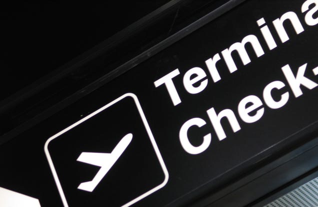
The granddaddy of wayfinding signage is the half-century-old Helvetica, which was developed in Switzerland. It has a supposedly “neutral” vibe which feels vaguely familiar and comfortingly classic, yet it doesn’t look dated. For readability it is especially embraced due to the distinctive shapes of its letters—including the lowercase “a” which will never be mistaken for an “o,” for example.
Frutiger
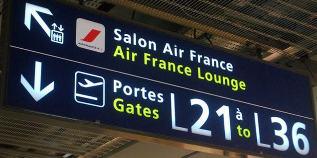
Frutiger was actually designed for an airport—Charles de Gaulle Airport in Paris—by Adrian Fruitger in 1975. Fruitger had developed the beloved Univers, another good sans serif font, but wanted to create something custom that would reflect the contemporary architecture of the airport. The typeface is known for having prominent ascenders and descenders—the parts of the letterforms that stick up and down like “l” and “p”—and wide apertures, or partially-enclosed openings inside letters like “e” and “n.”
Clearview
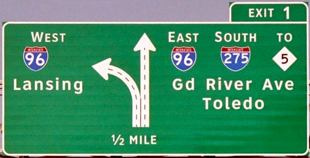
Specifically developed for the American interstate highway system in the early 2000s, Clearview was almost data-driven based on legibility at a distance. The biggest changes to make the type more readable came in the expansion of counter spaces, the enclosed spaces in letters like “a” and “g,” and higher relative heights from lowercase to uppercase, like the difference between “x” and “X”
Now as you’re running to your gate because the security line was so long or whiling away the hours at the bar before your next delayed flight, you can play guess the font and make your time at the airport that much more fun. [The Atlantic via @NicolaTwilley]
Photos by Hugger Industries, Daydreaming Crocus, A Year in Perigord, Aavindraa

