By Juan Valdes from nationalgeographic.com:
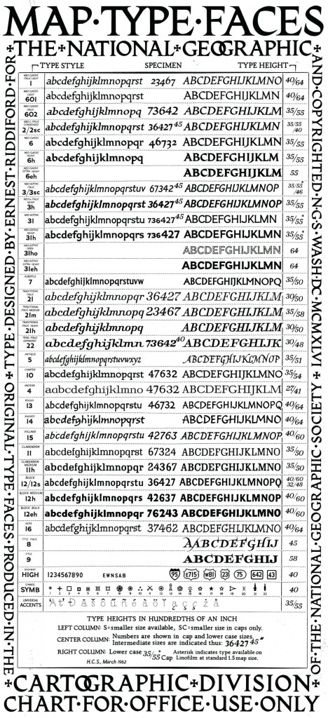
Our maps have long been known for their distinctive typefaces. But few outside the Society know little of the history that lies behind them.
Until the early 1930s, most of our maps were hand-lettered—a slow and tedious process requiring great patience and even greater skill. An alternate process—that of setting names in movable type, pulling an impression on gummed paper that was then pasted down on the map—often yielded less than durable or clearly readable type.
The Society’s first Chief Cartographer, Albert H. Bumstead, believed the answer lay in photographic type. Laboring long hours in his home workshop, he discovered that existing typefaces did not lend themselves to Society standards: our map enlargement and reduction factors often caused small hairline letters to break up while larger block letters tended to fill up. To this end, he invented a machine for composing map type photographically that ultimately improved overall type legibility. Once this photolettering process was refined, it was applied to our United States map supplement in the May 1933 National Geographic.
Shortly thereafter, Society cartographer Charles E. Riddiford was tasked with designing typefaces with much improved photomechanical reproductive qualities. He devised a set so attractive and legible that these typefaces are still used (in a digital format) today. These patented fonts were designed with the purpose of reflecting, as well as accentuating designated map features. If you study our reference maps and atlases closely, it’s quite evident that every feature is associated with a specific typeface. Color and typographic weight (from light to bold) further adds to this distinction.
Juan José Valdés
The Geographer
Director of Editorial and Research
National Geographic Maps


