 By Ben Taylor from taybenlor.com:
As someone who does work on both the development and design side of iOS apps I find that many designers struggle with the transition to UI work, or with the different processes involved in iPhone and iPad app design. In this guide I’ll describe the deliverables you’ll be expected to produce, outline the constraints of the medium and introduce fundamental iOS and UI design concepts.
The Medium
Knowing your medium and its quirks is an important part of being a good designer. I’m sure you’ve been witness to large print-outs with horrible pixelation artefacts – the result of misunderstanding print media. Similarly misunderstanding the role of pixels on screen can result in blurry, squished, or pixellated designs.
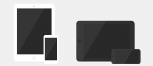
iOS devices come in two main form factors, the iPhone and the iPad. (For simplicity I’ll be leaving the iPod Touch range out. In almost all cases it can be treated like an iPhone, so let’s ignore it for now.) While this seems quite simple on the surface the iPhone 5, the iPad mini and Retina screens have added a bit of complexity. The most important difference is between the devices that have Retina screens and those that don’t. A Retina screen shows an incredible level of detail which makes good design look even better. Unfortunately it also makes certain mistakes much more obvious.


