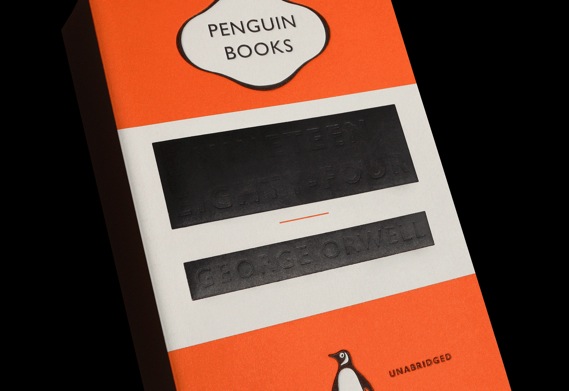
My personal opinion about the cover of Nineteen Eighty-Four: Beautiful conceptual design with its “redacted” look, but the type isn’t visible except when held in your hand, so the effect is completely lost on a bookstore shelf or online.
By Mark Sinclair from CreativeReview:
Brand new covers for five of George Orwell’s works feature in a new series published today by Penguin and designed by David Pearson. The set includes a remarkable take on Orwell’s most well known novel, Nineteen Eighty-Four…
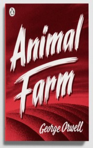
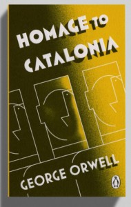
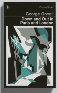
Animal Farm, Down and Out in Paris and London, Homage to Catalonia, and Politics and the English Language are also republished today in new ‘Great Orwell’ editions.
Pearson’s adept use of type – as demonstrated in his work on Penguin’s Great Ideas series of short, influential texts – is once again at the fore of each of the designs. And that includes what is perhaps one of Penguin’s most radical covers of recent years, for Nineteen Eighty-Four, where the title and author’s name are almost completely obscured by black foiling.…
Pearson says that the design went through numerous iterations “to establish just the right amount of print obliteration. Eventually we settled on printing and debossing, as per the Great Ideas series, with the difference being that the title and author name were then blocked out using matt black foil. This had the effect of partially flattening the debossed letters, leaving just enough of a dent for the title to be determined – though I can’t vouch for its success on Amazon.”

