 By Nick Sherman in Typography & Web Fonts via A List Apart:
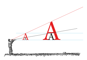
For ideal typography, web designers need to know as much as possible about each user’s reading environment. That may seem obvious, but the act of specifying web typography is currently like ordering slices of pizza without knowing how large the slices are or what toppings they are covered with.
If someone asked me how many slices of pizza I wanted for lunch, I would probably say it depends on how large the slices are. Then—even if they told me that each slice was one eighth of a whole pie, or that they themselves were ordering two slices, or even that the slices were coming from Joe’s Pizza—any answer I might give would still be based on relative knowledge and inexact assumptions.
Such is the current situation with the physical presentation of responsive typography on the web. The information at a designer’s disposal for responsive design is virtually nonexistent outside the realm of software. Very little knowledge about the physical presentation of content is available to inform the design. The media query features of today can only relay a very fragmented view of the content’s actual presentation, and related terms from CSS are confusing if not downright misleading.


