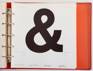
 From TheAtlanticCities.com:
Late one night last August, three Pentagram designers rummaging through the design firm’s basement archives found the Rosetta Stone of New York subway graphics: the original Standards Manual, designed by Bob Noorda and Massimo Vignelli in the late 1960s.
The 180-page binder, the key to the system’s iconic design choices, outlines a meticulous vision of signage intended not merely to look good — though it does — but to simplify navigation of the subterranean labyrinth. In its attention to passenger behavior, the manual goes above and beyond what most of us would term graphic design.
The existence of the book is well-known; its contents legendary. But apart from a few off-kilter snapshots posted to Flickr in 2006, images of the document itself were scarce. So when Niko Skourtis, Jesse Reed and Hamish Smyth found the 1970 manual in a locker beneath a pile of dirty clothes in the Pentagram basement, they did the world a favor and posted its pages, PDF by PDF, on a new website.


